A chart’s capacity to convey information is mostly wasted. The untapped opportunity lies beyond the simple rectangles of a bar chart. We can find it in the other pieces of the graphic that help you see what those rectangles have to say.

Look at a good newspaper chart, a graph in an annual report, or a century-old diagram. Their care extends beyond their marks. Typography reinforces the statistical plot. Color draws the eyes to where they need to go. Gridlines and axis labels are there for when they are needed without getting in your way. Today’s finer chart examples still accomplish much of this work by hand, chart by chart.
We built dbt Charts in a way that makes careful design consideration routine. Every part of the chart should have a reason to look the way it does, and those reasons must agree and combine for a more engaging and effective composition. dbt Charts renders dashboards from YAML, and that process is rich with intention.
Take electricity for example.
In Bangladesh, basic access rose from 32% to 99.5% of the population between 2000 and 2024. The layered bars show that amazing leap alongside the rest of Southern Asia: rust for the initial year, charcoal for the more recent year.
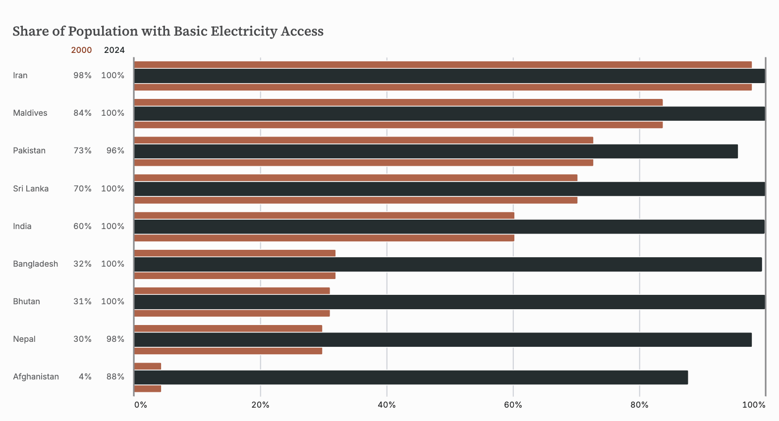
Country names align left for easy scanning. Percentage values sit beside those names, supporting the corresponding bars. Colored year headings identify each series, without a separate legend. A heavy 100% rule reinforces the chart’s relative scale. The names, values, and bars share a coordinate system, so their alignment holds as sorting changes.
These details are system options and defaults. Here, a layer chart combines support_table with a rust-and-charcoal palette from our clarity theme.
Now consider how that electricity is generated. In India, let’s spotlight solar’s rising contribution. The line graph below puts the series names at the ends of their lines. Month and year label the temporal axis, with the year only appearing where the calendar context changes. Line thickness responds to the density of points on screen. The partner donut chart carries direct labels and uses its center to display the total.
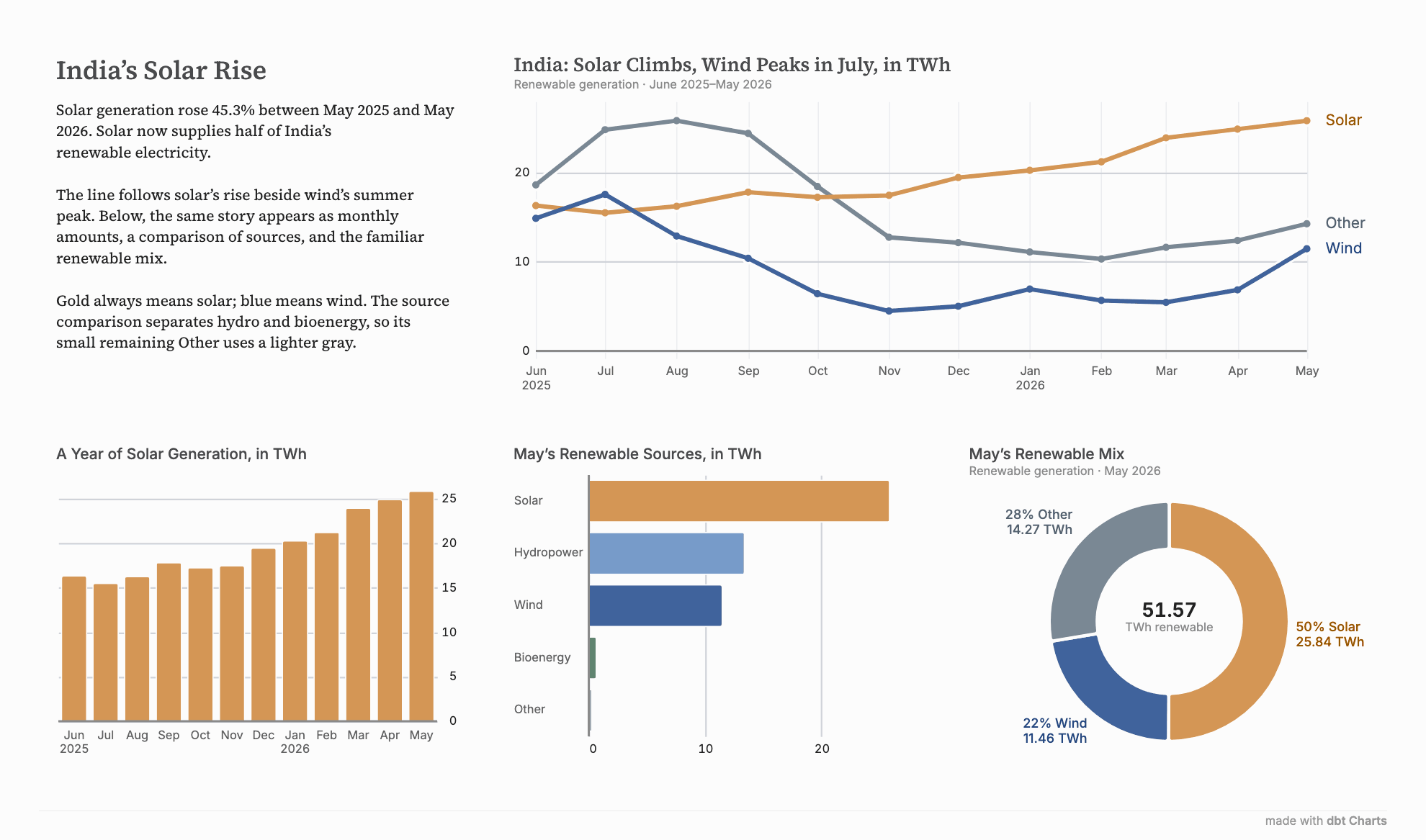
Solar is colored gold everywhere on this board because the board assigns colors to sources, keeping the line graph, source comparison, and donut consistent even if their categories appear in a different order. Darker companion inks keep labels legible: notice how solar’s label is a darker gold.
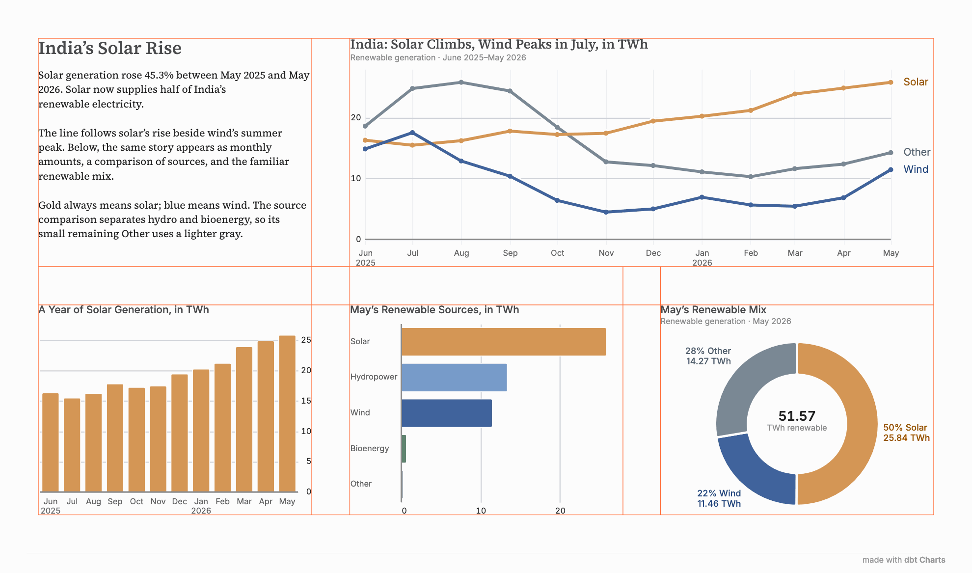
The orange guides below expose another shared decision: how those charts fit together. Prose and charts occupy one modular grid, with common spacing that aligns titles and plot areas. A wide chart can span columns while smaller charts share a row below it.
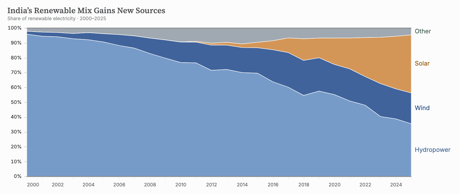
In the longer view below, solar’s gold band grows from almost nothing to a substantial share of India’s renewable generation. Zero and 100% remain firm landmarks, enclosing the same total height each year. The series names now center on the ends of areas instead of lines. The chart changes form and timespan while keeping the color and labeling conventions. Here, Other combines bioenergy and remaining renewables.
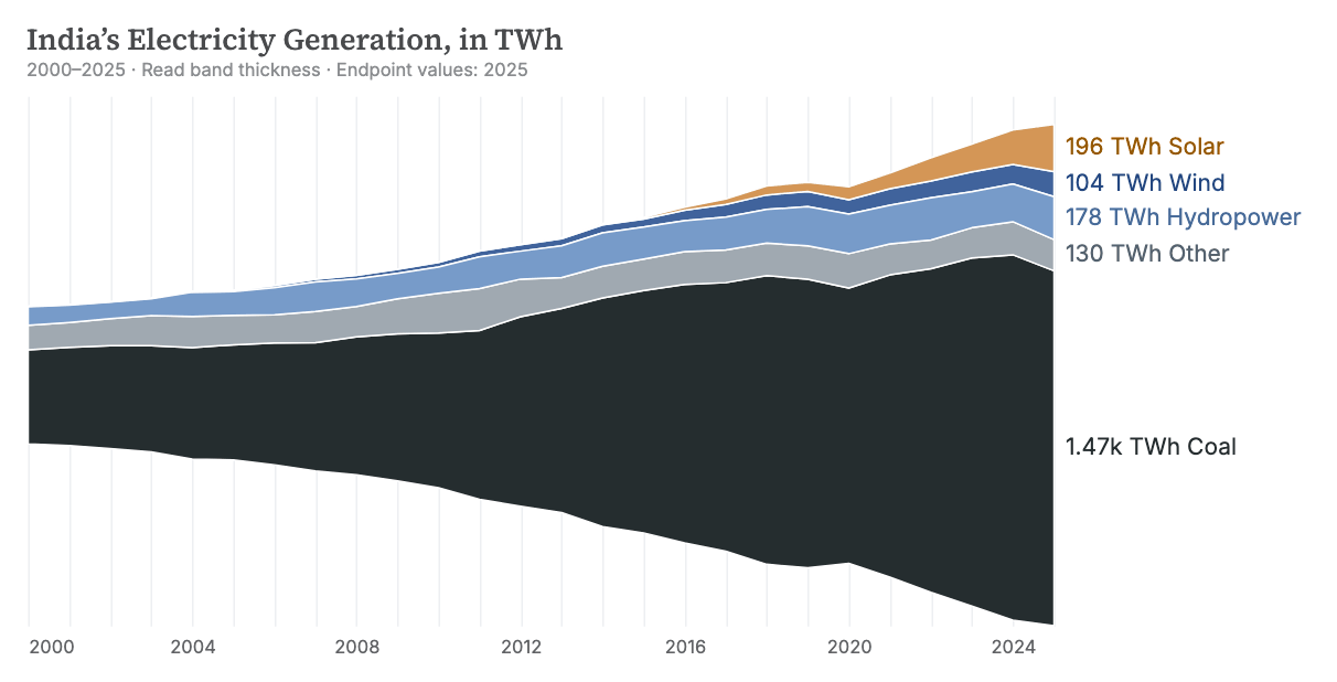
That renewable mix is only part of India’s electricity supply. Add coal and other sources, and the full system takes a different shape. The streamgraph below gives coal a near-black band while preserving our familiar colors. Together, the two charts let the reader follow solar’s promising rise in the context of total generation.
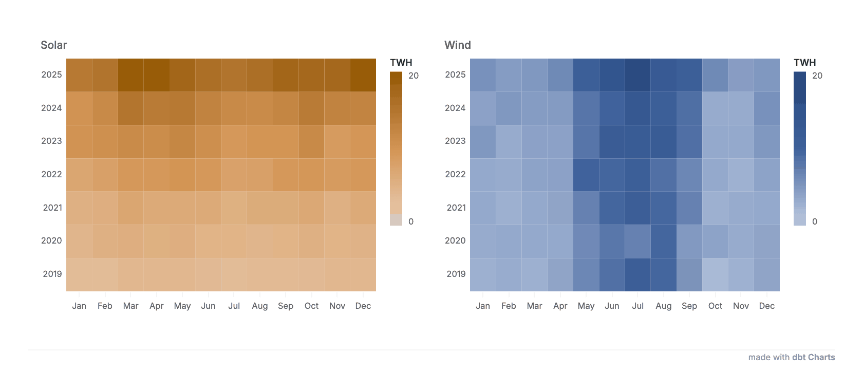
Arrange monthly values in a calendar and darker cells reveal two different stories: wind’s summer peak and solar’s general rise. Each chart draws its intensity scale from the source’s assigned hue. The color keys show the fixed 0–20 TWh range used by the cells, keeping the year-to-year comparison consistent. The most recent year sits at the top.
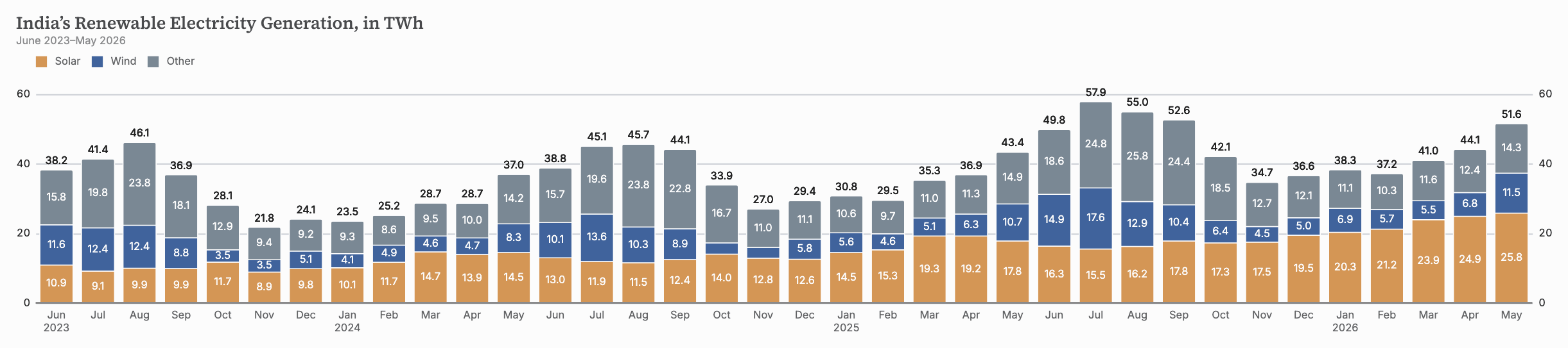
To read those seasonal changes as amounts, return to monthly columns. This time, individual value labels sit inside segments while the stack total lies outside. Across this particularly wide composition, duplicated vertical labels put a ruler beside both ends of the chart. Other combines hydropower, bioenergy, and remaining renewables.
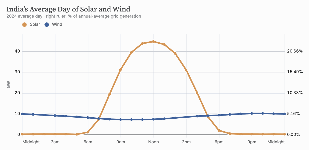
Let’s change our timescale again to see when power arrives across the day. Average a year of hourly observations and solar’s daily curve appears centered at noon. The axis uses words people recognize, Noon and Midnight, to mark time. The right ruler translates the left ruler’s GW ticks into percentages of annual-average grid generation: 10 GW meets 5.16%. One set of gridlines supports both readings.
These changes of view need explanation as well as consistent graphics. In the full board below, prose introduces regional access, connects it to India’s generation, and defines the sources and measures. Each passage is authored as one block and flows into columns with measures chosen for readability. Text takes its place in the composition through the same system of spacing and alignment as the charts.
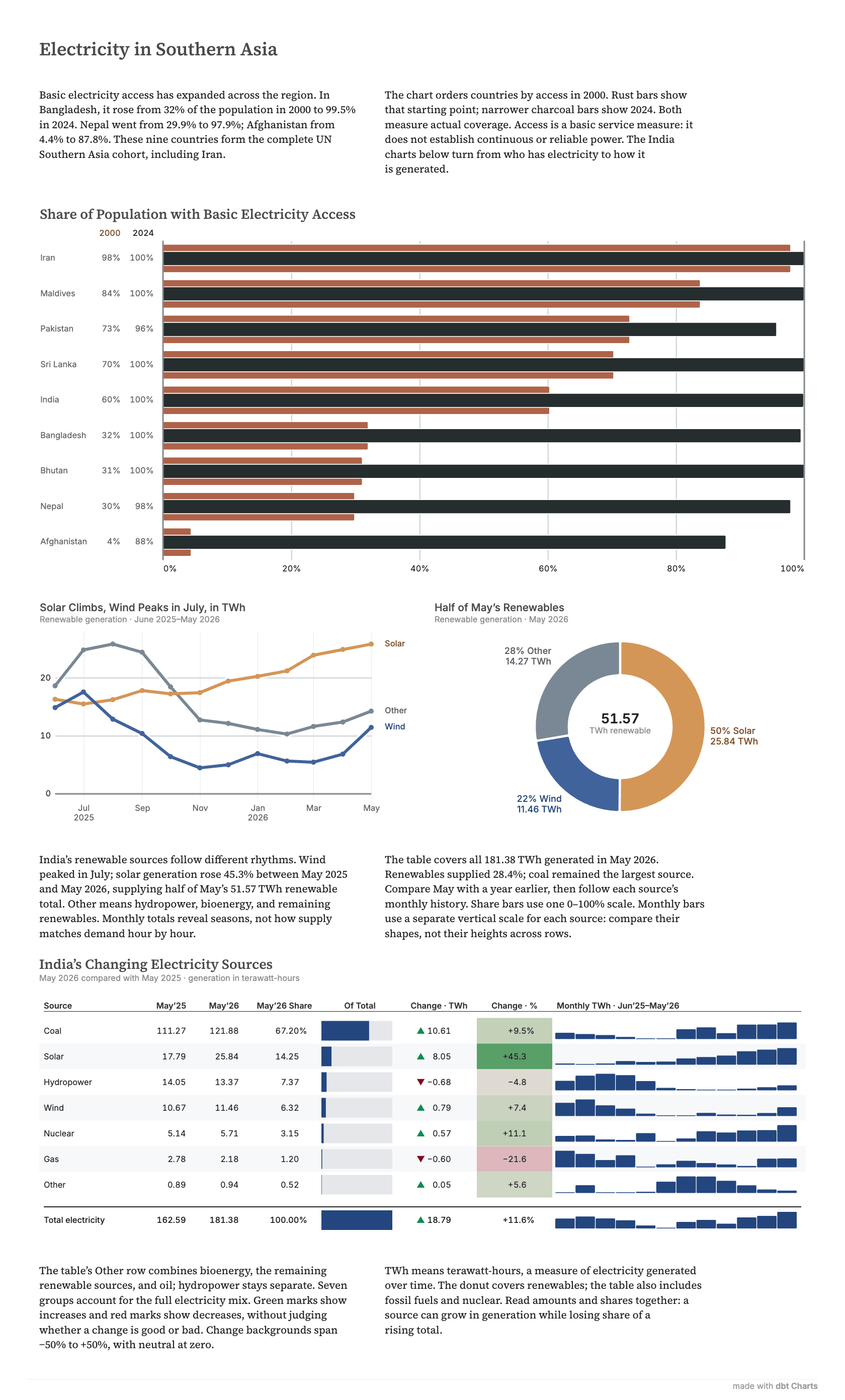
The bottom table extends that care to the accounting. Headers center over the numbers, which are arranged in decimal-aligned columns. A percentage column declares its unit in the first row, letting us focus our attention on the values, not the repeated suffix. Spark bars and background fills illustrate patterns alongside exact amounts; a distinct summary row makes the total easy to find.
A charting system should carry more of the repetitive design judgment that can be programmed: how months and years share an axis, how colors connect charts, how numbers line up for comparison. These details have often been treated as flourishes. We believe they should be in the defaults.
Data from the World Bank and Ember via Our World in Data. Hourly India data from Mukherjee, Kalita, and Kumar, Mendeley Data v2 (CC BY 4.0), averaged for these charts.