Every chart with two vertical scales, dual axes, hides an exchange rate: some number of right-axis units equals one left-axis unit. On a dueling chart, that rate is mysterious to the reader. Consider the following example.
Airfare and gas prices both peaked in June 2022. A chart with two vertical axes, one for each measure, can show both prices on the same plot.
This approach shows a little too much. It fails in two ways.
First failure: false crossings
Watch what happens when we change only the range of the right axis, the scale for gas prices, and leave the data alone:
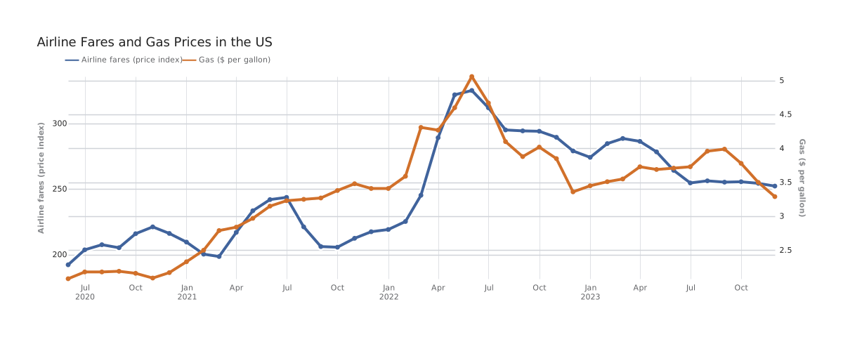
Note how interesting relationships between the orange and blue lines appear and vanish depending on the chosen scale of the right axis (gas price). These graphic hallucinations include associations and intersections. The data in this animation never changes, but the view changes a lot.
That’s why charts with a dueling second axis deserve their bad reputation. Where the lines cross, which one sits higher, and how closely they track are all functions of how the two ranges were set. Stephen Few put the problem with two scales in four words: “their intersection means nothing.”
One thing in the animation never moves: both lines spike in June 2022. A second scale can fake crossings and closeness, but not timing. Where each line peaks, turns, rises, or falls survives any rescaling. If you must read a dueling chart, read it for when.
Crossing lines on a dueling-axis chart misrepresent one of the beautiful features of a line graph. On a common scale, a crossing between two series is real news because one quantity passed the other. William Playfair showed such crossings in many of his export and import charts, such as the figure below. He even highlighted the crossings by shading the gaps between the curves and noting whether the balance ran in favor of or against England.
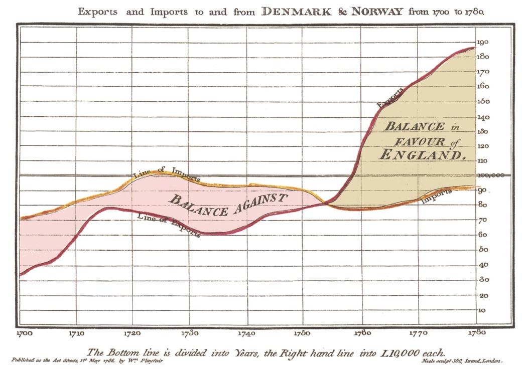
William Playfair, Exports and Imports to and from Denmark & Norway from 1700 to 1780 (1786).
If you insist, dbt Charts will draw a chart with competing axes, but not without a warning:
$ dct render charts/airfares.yml
⚠ 1 warning:

WARN-DUAL-AXIS-COMPETING-SCALES
Chart 'airfares': 'gas' is drawn against its own y-axis, separate from 'fares'. The two scales are set independently, so where the marks cross, which one sits higher, and how closely they track are artifacts of the axis ranges, not the data: readers will see a relationship that may not exist.

Fix: Show each measure in its own chart, stacked so they share the x-axis. To compare trends in one chart, index both series to a common start (e.g. 100) in the query so they share one axis; to show how one measure moves with the other, plot them as a scatter. If the second series is the same quantity in another unit (°F/°C, $/€), remove the layer and relabel the chart's opposite edge with `style.axis_y.mirror` and an `expr` that converts the value (for example `format(datum.value * 1.8 + 32, '.0f')`): one scale, two unit labels. Where the audience expects this form, list the code in the chart's `warnings_ignore:`.
An agent building your board gets the same warning as JSON. That matters: bad software defaults have taught every generation of chart makers, and now their agents, to reach for a second axis.
The warning’s proposed fixes are standard design practice. These better alternatives are, from left to right: give each measure its own chart, plot one against the other as a scatter plot, or index both measures to a common start.
The third alternative, an index chart, divides each series by its own value in one base month, so both anchor to 100 and every other point reads as a percent change from that month.
Unfortunately, index charts suffer from a similar problem: changing the base month changes how the two lines appear to relate. See below how changing the black-dot index date changes the views of our data:
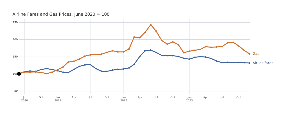
Graphic mischief remains. A century ago, Karl G. Karsten warned in Charts and Graphs that with index numbers, “obviously a great deal depends upon the base you choose.”
Second failure: competing gridlines
The second failure of dueling-axis charts is their competing sets of gridlines. It’s an issue that receives less attention. Each scale brings its own ticks, and each set of ticks brings its own gridlines. Here is our opening chart again. Notice the gridlines:
Look at those horizontal gray lines. What a mess. Two ladders, out of step, laid over one plot. No line tells you which ladder it belongs to.
Charts cope with competing gridlines in different ways. An old method is matching a scale’s color to its line. Karsten recommended it in 1923. John Burn-Murdoch pushed that idea one step further in the 2022 chart below. Each set of gridlines takes the color of its axis and then fades out as it crosses the plot.
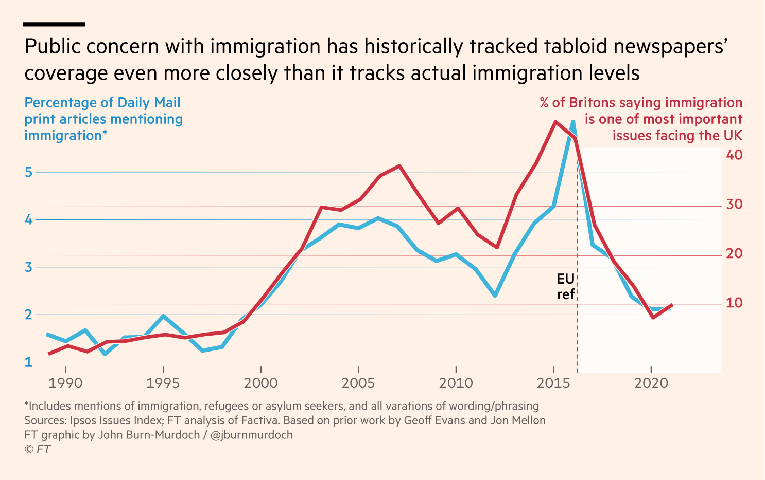
John Burn-Murdoch, Financial Times (2022), via Datawrapper.
Simpler fixes for competing gridlines include keeping only one set of gridlines (but retaining both sets of labels), staggering the second axis into awkward intervals so that it can use the primary axis’s gridlines, or not letting the gridlines cross into the plot at all.
Near the end of his life, William Playfair produced a clever solution to competing gridlines. He plotted colorful series on a universal grid of numerals. Each series carried its own units. The detail below is from the 1824 edition of his chart, published after his death. The gridline labeled 20 means 20 farthings per quartern loaf if you are reading the Bread line, or 20 million pounds if you are reading the Exports curve.
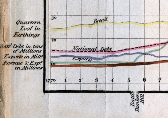
Detail of the chart below.
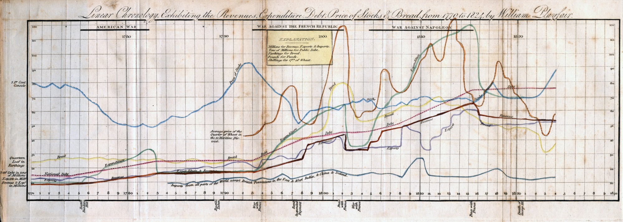
William Playfair, Linear Chronology, Exhibiting the Revenues, Expenditure, Debt, Price of Stocks & Bread, from 1770 to 1824 (1824).
Playfair’s unitless grid ends the gridline mess. But his plot retains the first problem: false crossings.
A century later, Karsten drew passenger cars and trucks on a common grid, with the truck scale set at one-fifth of the car scale and printed beside it. He called it “the sound position for two vertical scales.” The dashed truck line still jumps over the car line in 1918, for no reason but that chosen ratio.
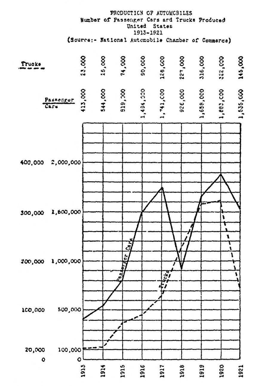
Fig. 145, “The Sound Position for Two Vertical Scales,” from Karl G. Karsten, Charts and Graphs (1923).
Karsten’s chart prints the exchange rate from the top of this post right on the page: on his grid, one truck counts as much as five cars. Sometimes that rate is a fact, like feet to meters. Sometimes it is a convention: climate diagrams fix 10 °C of temperature to 20 mm of rain, so a rain line that sinks below the temperature line always marks a dry month. An index chart sets it with the base month. On a dueling chart, the author picks the rate, but the reader never sees the choice.
Not every second axis is a duel
Dueling axes are the familiar second-axis story, but it is an incomplete tale. Some second axes are perfectly honest. Their exchange rate is a fact, not a choice.
Playfair’s better-known 1821 wheat chart prints the same shilling scale on both edges, so a reader at the far side has a ruler too.
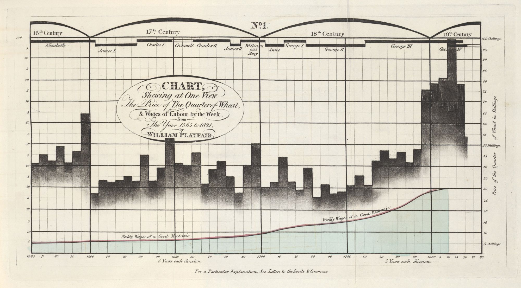
William Playfair, Chart Shewing at One View the Price of the Quarter of Wheat, & Wages of Labour by the Week, from the Year 1565 to 1821 (1822).
Mirroring axes is particularly helpful for wide charts. In dbt Charts,
that’s one line, mirror: true, under style.axis_y.
The other honest second axis is a translation: one scale, labeled in two units. In James Glaisher’s Travels in the Air (1871), the plate of Camille Flammarion’s 1867 balloon flight from Paris to Solingen has meters on the right and feet on the left. There is one line, one ladder of gridlines, and two languages for reading it.
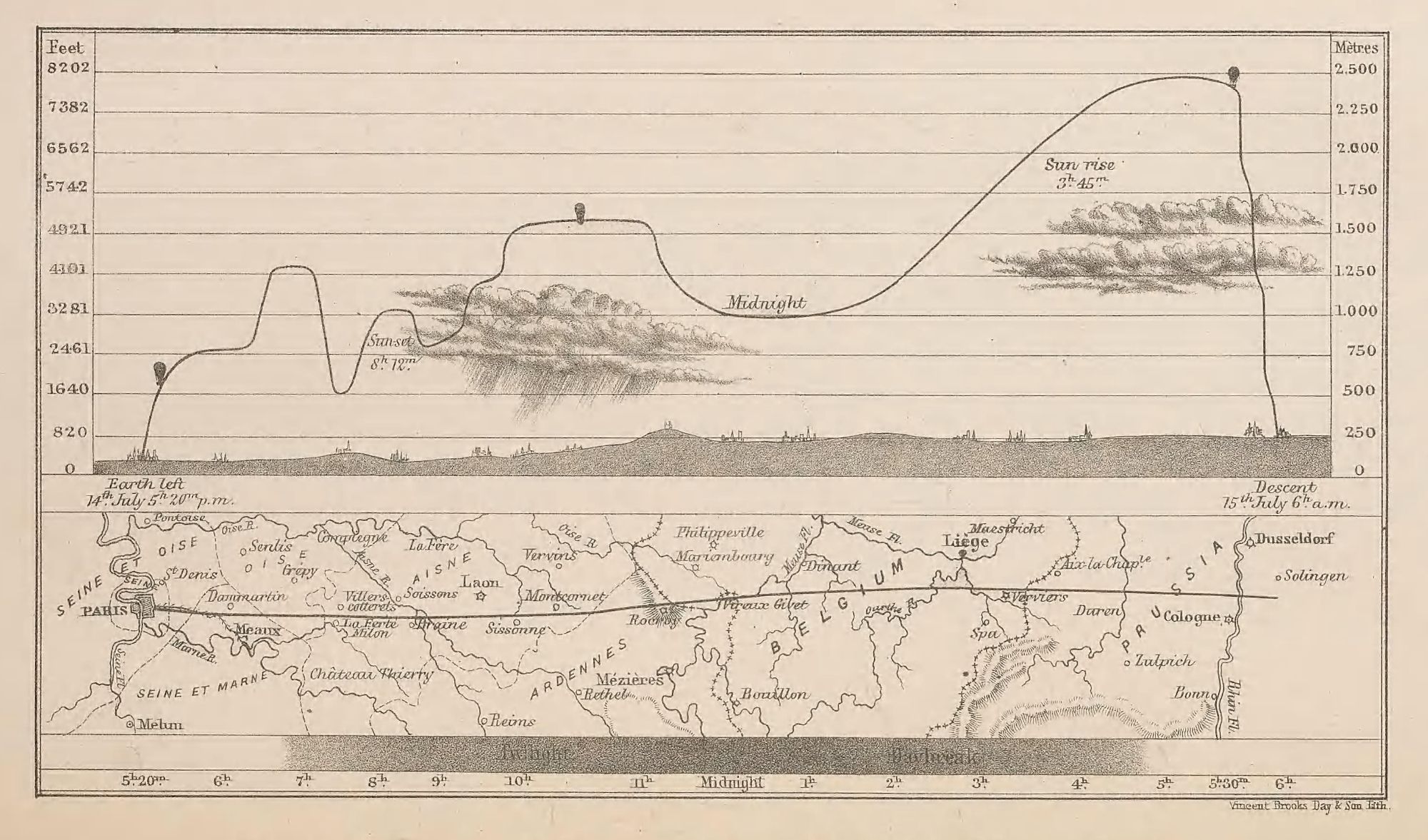
Course of the Balloon in M. Flammarion’s Ascent from Paris to Solingen in Prussia, July 14-15, 1867, from James Glaisher, ed., Travels in the Air (1871).
Translation helps a global audience: imperial and metric units, currencies, time
zones. Give mirror an expr instead of true, and dbt Charts relabels
the far edge in another unit:
Textbooks endorsed translated axes early. In 1914, Willard Brinton drew a stacked bar of locomotive coal in millions of tons on the left and millions of dollars on the right, so “the same data can be interpreted from two different standpoints.”
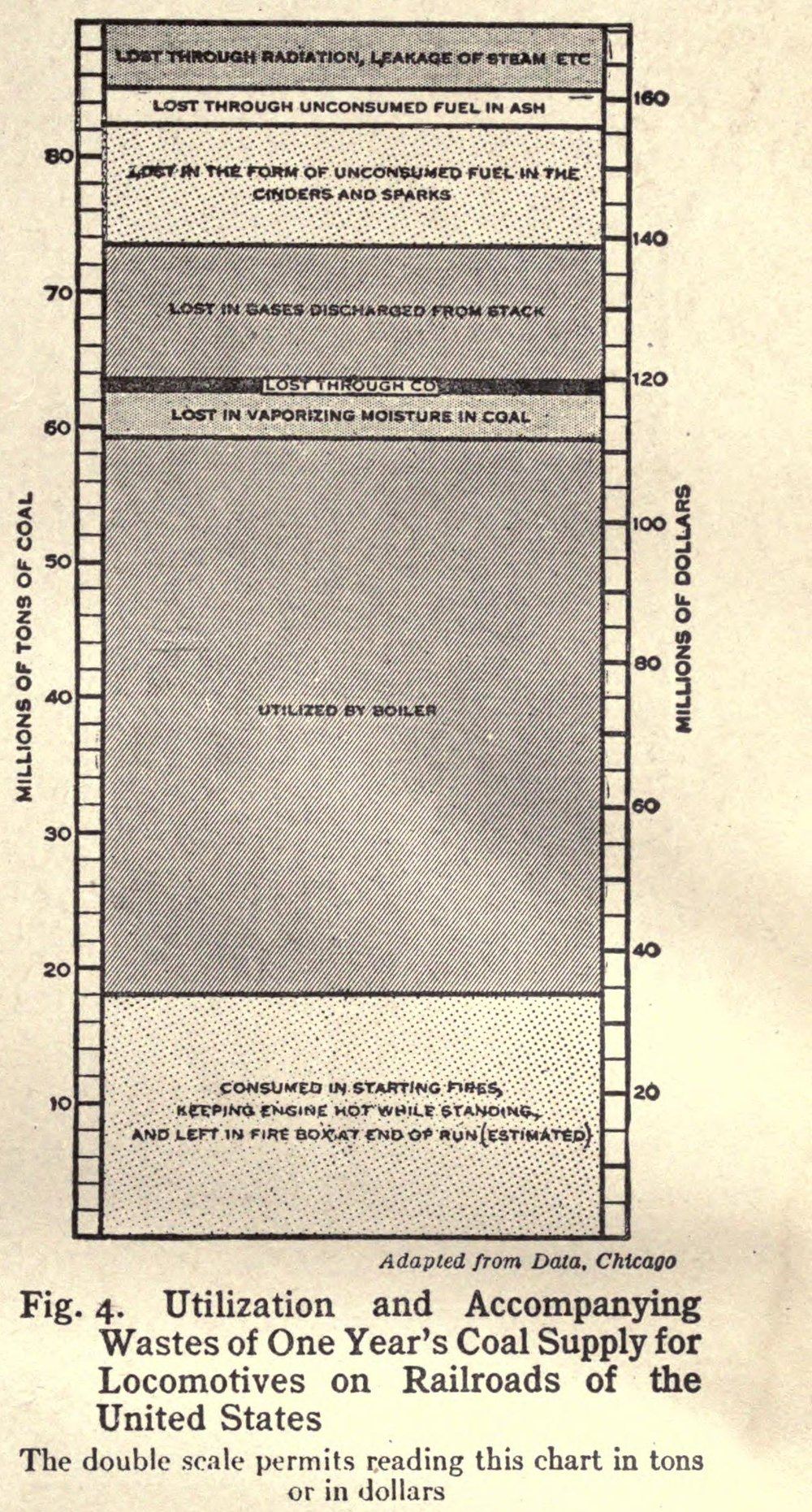
Fig. 4 from Willard Brinton, Graphic Methods for Presenting Facts (1914).
Return to the chart at the top of this post. In every frame of the animation, airfares and gas both peaked in June 2022. Everything else, where the lines crossed and how closely they tracked, came from an exchange rate nobody stated.
That is the difference between dual and dueling. Translated axes, like feet and meters or currency conversion, share an exchange rate set by definition. Mirrored axes have a 1:1 exchange rate. But competing axes relate by a mysterious exchange rate. Even their authors don’t explicitly choose or acknowledge the relationship between the sides.
Before you add a second scale, ask who sets the rate. If the answer is no one, consider a different view.