The waterfall below could not exist in dbt Charts two weeks ago. It shows our own GitHub issues since launch: 31 you filed, 21 we filed, and the 29 that today’s release closes. Hover over any bar to see its details.
We drew it with y_start, a new field that lets a bar start somewhere other
than zero. That one line of YAML opens up waterfall charts, gantt charts,
candlestick charts, dumbbells, and lots more. We sped it into production
because a new user asked for it.
Two weeks of beta
dbt Charts launched its public beta at dbt Summit in Las Vegas. The enthusiasm from you has magnified our own excitement. One evening, in the back of Momofuku, RJ was describing our approach to dashboards you can code review, and the person across the table went wide-eyed: aha! We saw that reaction again and again that week, as people realized their charts could finally receive the same control and consideration as the rest of their data projects.
Since then the open source dbt-charts repository has passed 540 stars, and your issues keep arriving: bug reports, requests for new warehouses, and feature ideas. Most issues from the community were triaged within a day. Today’s release, dbt Charts 0.9.0, fixes 28 of the 31 bug reports so far and adds Athena and ClickHouse to the warehouses dbt Charts supports.
Not every conversation happens on GitHub. We hold community office hours, which we announce in the #dbt-charts channel of the dbt Community Slack, and that channel is the fastest place to ask a question or start a discussion.
Thanks to everyone who has given us feedback or reported issues so far. Your input is helping shape dbt Charts.
A waterfall, please
One week into the beta, a VP of Finance sat down with RJ to move a report into dbt Charts. It lived in Google Slides. Every element could be rebuilt as code in dbt Charts, except one: a waterfall chart.
A waterfall chart walks from one total to another through the changes between them. Each bar starts where the last one ended. Until last week, every bar in dbt Charts started at zero, so the chart type that report needed wasn’t possible without a hack.
The idea wasn’t new to us. RJ had already sketched it on our visualization roadmap under range and span marks: “Sometimes the honest picture is a span, a high-to-low, a before-and-after gap.” With a real need in front of us, we designed, built, and implemented it in two days.
One line of YAML
Here’s how the waterfall chart at the top of this post is made. Its query
counts the issues open before (open_before) and after (open_after) each
step. If we plot open_after as an ordinary bar chart, every bar grows from
zero, and you get the chart below. The chart is accurate, but it tells the wrong
story: each bar is the running total of issues still open after that step (31,
52, 49, 20, and 20), not what that step changed.
charts:
  backlog:
    query: backlog
    type: bar
    x: step
    y: open_after
    style:
orientation: verticalAdd one line, and each bar starts where the one before it ended:
charts:
  backlog:
    query: backlog
    type: bar
    x: step
    y: open_after
    y_start: open_before
    style:
orientation: verticalColor the bars by the query’s direction column and turn on labels, and you
have the chart at the top of this post. Each label shows the bar’s change, y
minus y_start.
A short history of floating bars
In 1765, nine years before he discovered oxygen, Joseph Priestley published A Chart of Biography. It drew about 2,000 lives, from 1200 BC to AD 1800, as horizontal lines that begin at a birth and end at a death. The length of each line is the length of a life, and where a date was uncertain, Priestley drew dots instead of a solid line. Every one of those lines is a floating bar. You can see his system at work in the mini version of his chart below.
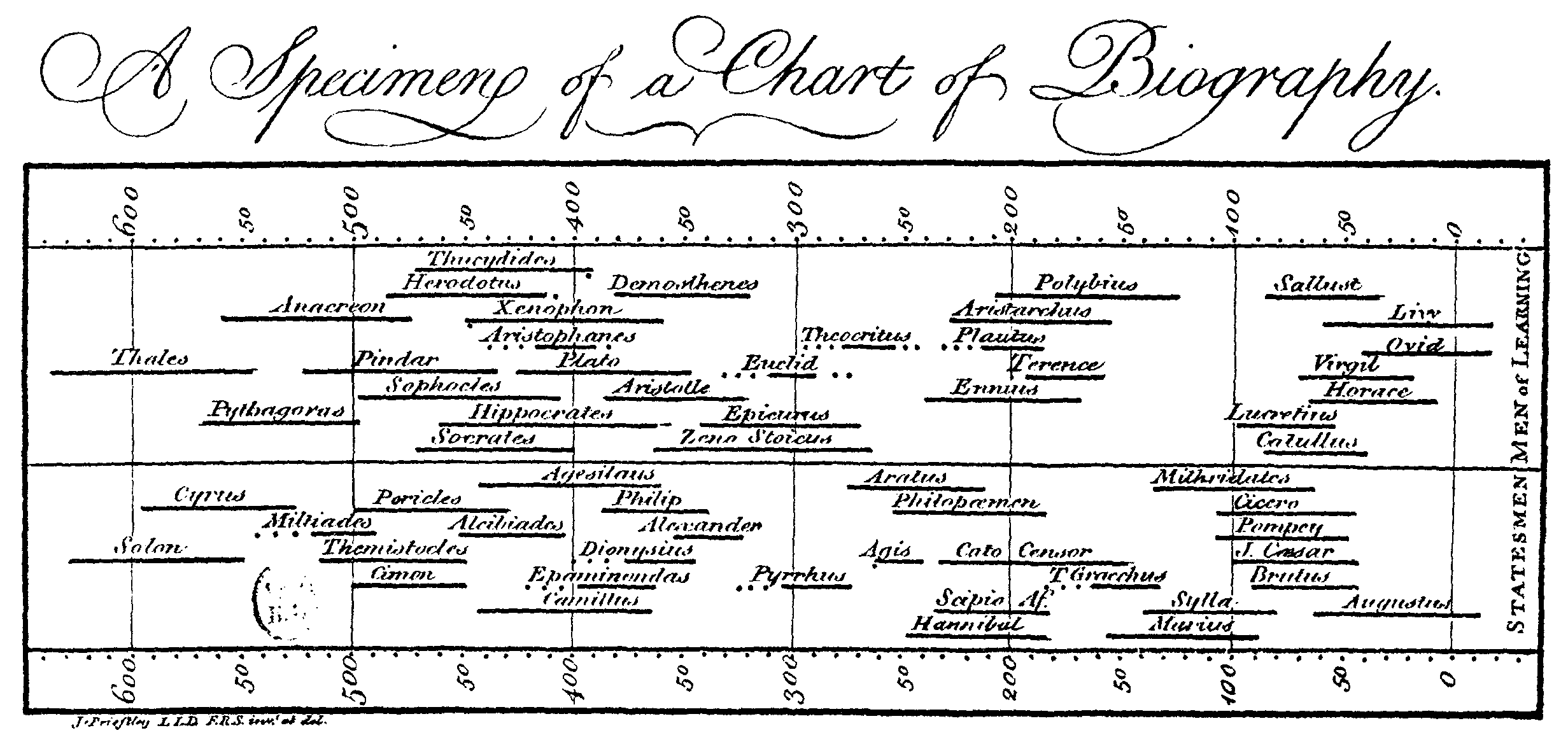
Joseph Priestley’s A Specimen of a Chart of Biography, the sample sheet issued with his Description of a Chart of Biography (1765).
Henry Gantt made floating bars a tool of industry. When the United States entered World War I, Army orders jumped from hundreds to millions of units. The required logistics exceeded the capabilities of contemporary data infrastructure. In 1917 the Chief of Ordnance, General William Crozier, hired Gantt as a production consultant, and Gantt laid out a calendar: a light bar for each period’s output and a heavier bar beneath it for the running total. Anyone could see at a glance how far production had fallen behind schedule. By 1918 his charts were tracking work in arsenals, naval aircraft production, and the government’s wartime shipbuilding program. John T. Thompson, an Army officer who won the Distinguished Service Medal for keeping the Army supplied, said Gantt’s chart had been his compass.
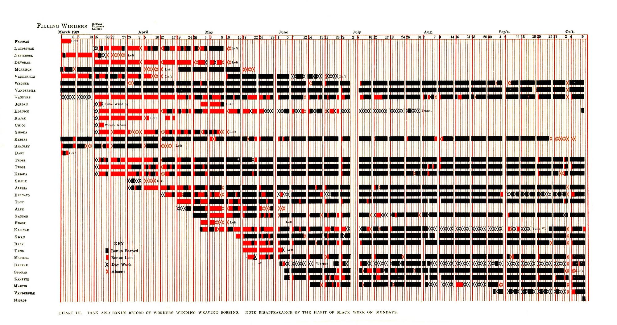
Chart III from Henry Gantt’s Work, Wages, and Profits (1910), a task and bonus record of workers winding weaving bobbins in 1909. Black marks a day the bonus was earned; red, a day it was lost.
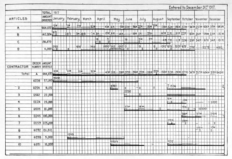
An Ordnance Department progress chart (top) and order chart (bottom), entered to December 31, 1917, from Henry Gantt’s Organizing for Work (1919). Light lines show each month’s deliveries; heavy lines show the running total.
Gantt died in 1919, but his chart kept traveling. Wallace Clark’s 1922 book The Gantt Chart carried it into textile mills, foundries, and machine shops. In 1929 Walter Polakov, who had worked with Gantt, took it to the Soviet Union.
The name “waterfall chart” was coined by management consulting. McKinsey & Company popularized it, and the earliest records we found back the connection, if not the invention. In his 1985 book Say It With Charts, Gene Zelazny, McKinsey’s longtime director of visual communications, drew the form without naming it: a starting column, a step up or down for each account, and an ending column, with arrows where we’d now draw bars.
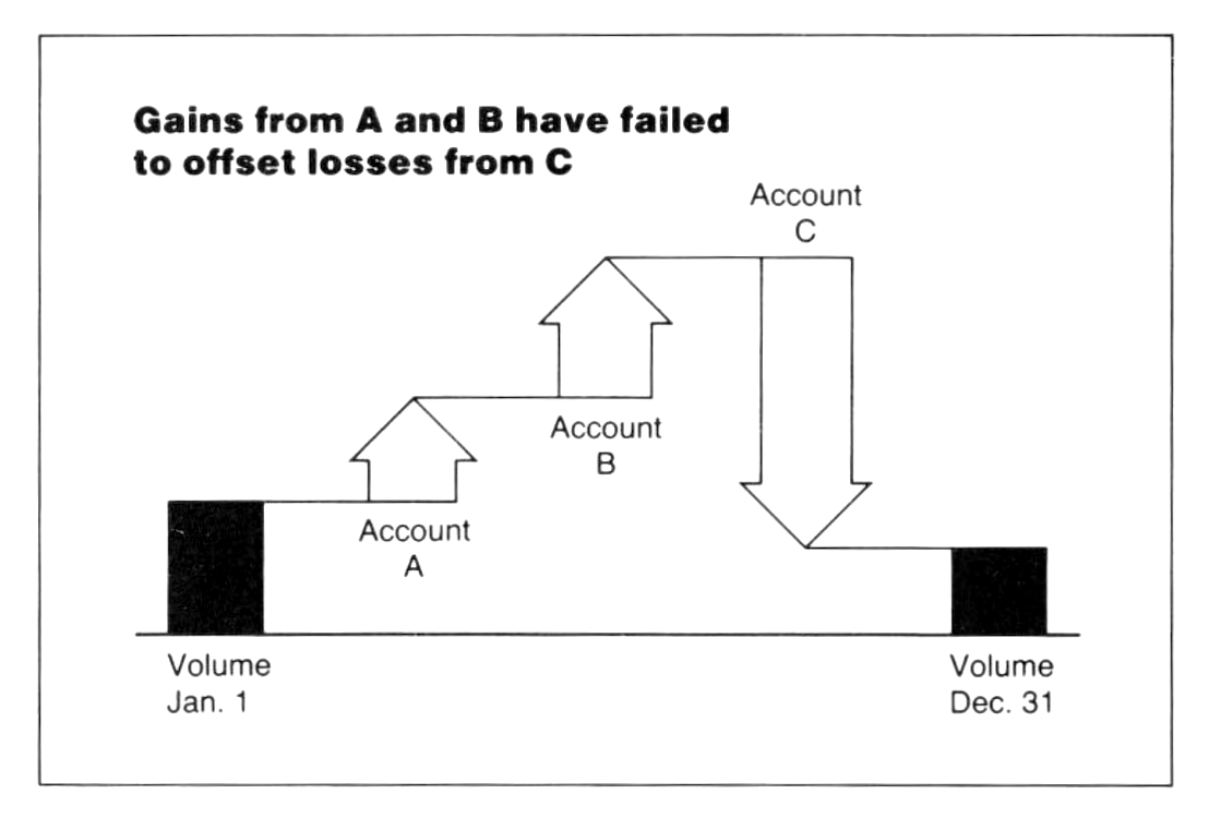
Chart 41 from Gene Zelazny’s Say It With Charts (1985).
By 1999 it had a name. In The McKinsey Way, Ethan Rasiel called it a waterfall chart, a form “seldom seen outside McKinsey.” Microsoft added a waterfall chart type with Excel 2016. Now dbt Charts draws it with one extra line of code.
One field, many shapes
We didn’t add a waterfall chart type. y_start is a property of every bar, so
the shapes people ask for by name fall out of charts you already know. In each
of these, x is the category and y is the measure, whichever way the bars
point.
A candlestick is a thin bar from low to high, with a wider bar layer from open to close. A gantt chart puts dates on both ends and turns the bars horizontal. A dumbbell is a hairline bar between two dots. A ranged dot is a pale interval behind an estimate.
Every recipe is in the playground gallery as an easy reference for you and your agent.
What’s next
y_start isn’t the only idea on that roadmap. We have detailed designs for
annotations, node-link diagrams like sankeys, narrative emphasis flourishes, and
pattern-texture fills that separate categories without relying on color. The
priority of their implementation will be influenced by what real users need
most.
A dashboard you’re trying to build is the best evidence we can get. If dbt Charts can’t draw something you need, tell us:
- Join our community office hours, announced in #dbt-charts in the dbt Community Slack.
- Start a discussion or ask a question in that channel.
- Open an issue on GitHub.
- Email support@getdbt.com.
y_start, 28 bug fixes, and Athena support are in
dbt Charts 0.9.0.
We look forward to seeing what you make with it.