Next to your models
Dashboards you can code review.
An open source language: the query, charts, and layout in one YAML file.
Quickstart
Paste into
Claude Code,
Codex,
dbt Wizard,
or any coding agent
I want to make charts of this data with dbt Charts. Run `uv tool install dbt-charts`, then `dct skills chart`, and follow what it prints.
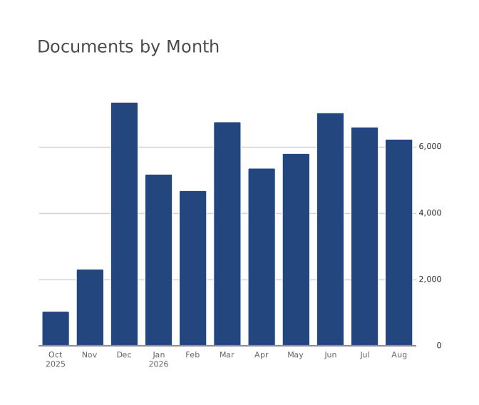
title: Documents by monthqueries: documents: | SELECT DATE_TRUNC('month', created_at) AS month, COUNT(*) AS docs FROM documents WHERE created_at >= '2025-10-01' GROUP BY 1charts: documents: query: queries.documents type: bar x: month y: docsThe chart is only four lines.
In your dbt project
charts/ right next to your
models/
Run dct anywhere in a dbt project: it finds dbt_project.yml and uses the profiles.yml you already keep. No second repo, no second credentials.
my_dbt_project/
  .git/
  dbt_project.yml
  profiles.yml
  models/
  charts/
    users.yml
    pipeline.yml
    themes/
      newsroom.yml
Reviewed like code
Broken charts fail in CI
A board names the models it reads. So the usual dashboard-breaker, someone renaming a column, fails the pull request that renames it. Not a Slack message on Monday.
Structural, with no credentials
dct init ci writes a GitHub Actions workflow that runs dct validate on every push: schema checks with no warehouse connection, so it runs on a fork's pull request.
Against your dbt models
Add dbt parse and every query reaching a model through ref() is checked against the columns that model produces.
Against the warehouse itself
dct validate --warehouse asks the warehouse the cheapest way it can: DESCRIBE on DuckDB, a dry run on BigQuery, EXPLAIN on Postgres, Redshift, and Snowflake. No rows scanned.
On the pull request that renames the column
$ dbt parse && dct validate charts

ERR-DBT-MODEL-COLUMN-MISSING
  charts/users.yml:14
  Column 'signup_source' is not in ref('fct_users').
  Did you mean 'acquisition_source'?

1 board failed, 14 passed.
Or before you rename it at all
$ dct impact signup_source --table fct_users

2 boards read this column:
  charts/users.yml
  charts/growth/acquisition.yml
One system, not a pile
Charts that fit together.
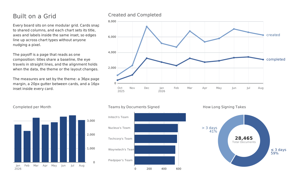
Most chart libraries are separately invented things: every type has its own idea of a margin, a legend, a label. Put four on a board and nothing lines up.
One grid
A prose card, a two-column line chart, and three one-column charts share one three-column grid, with the same margins, gutters, and insets whatever the chart type.
One type scale
Title size follows card width, not chart type. Every chart title at the same width matches exactly.
One set of spacing rules
Plot padding, gutters, and card spacing come from the theme, not from whatever each chart type happened to be built with.
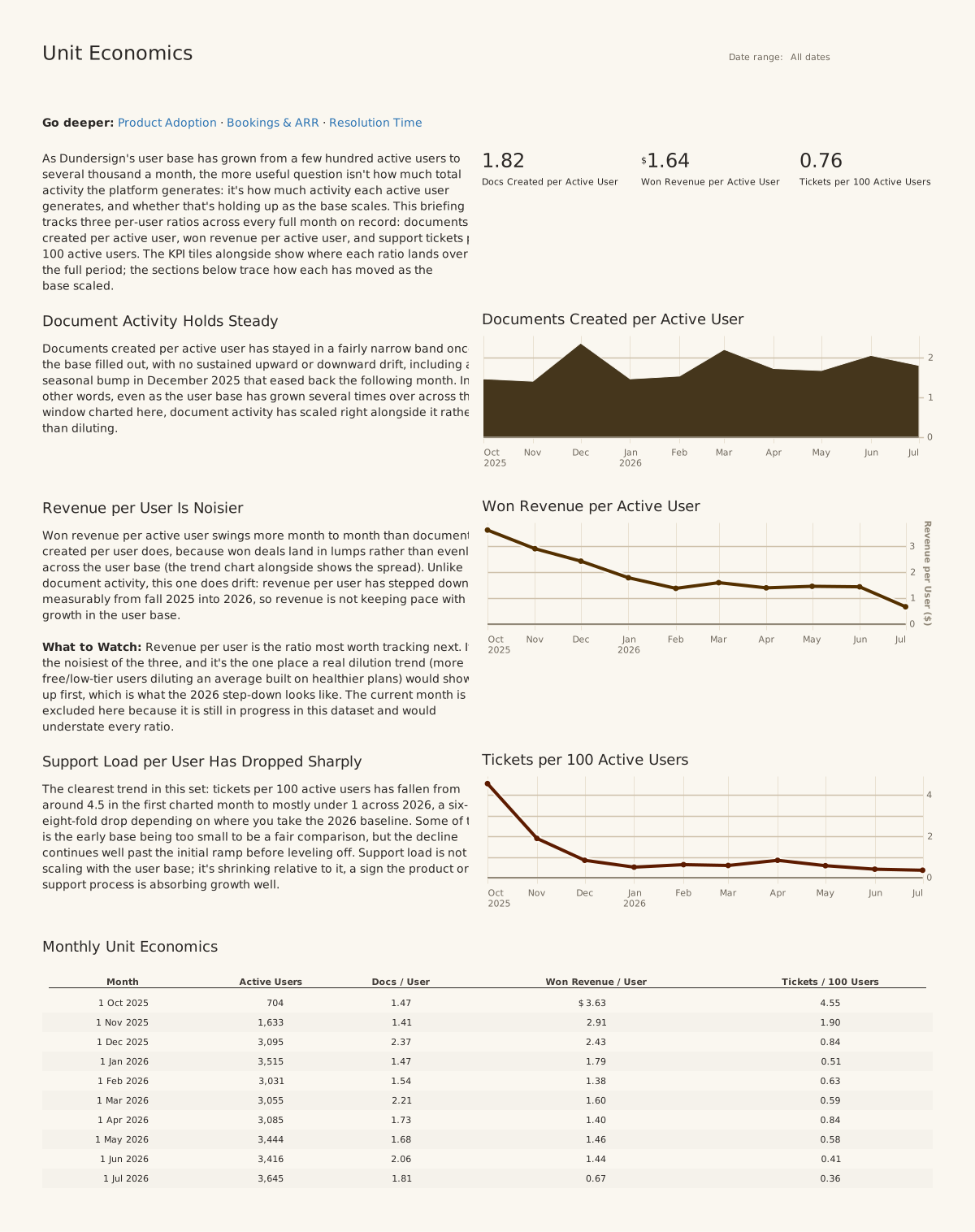
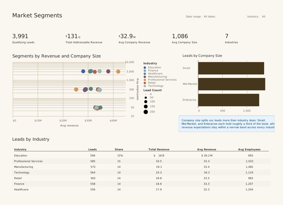
The range
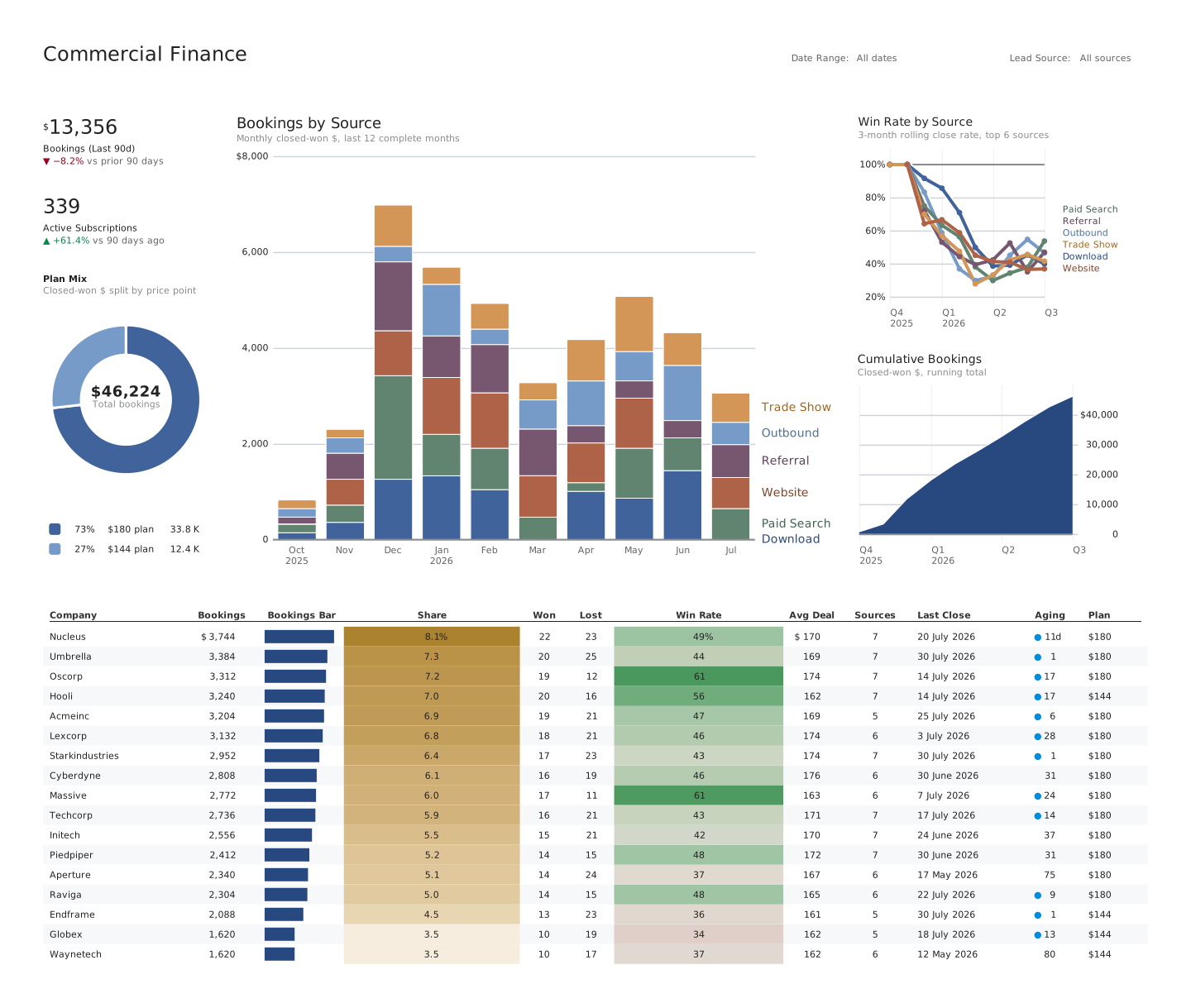
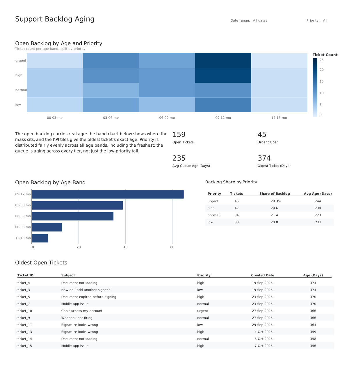
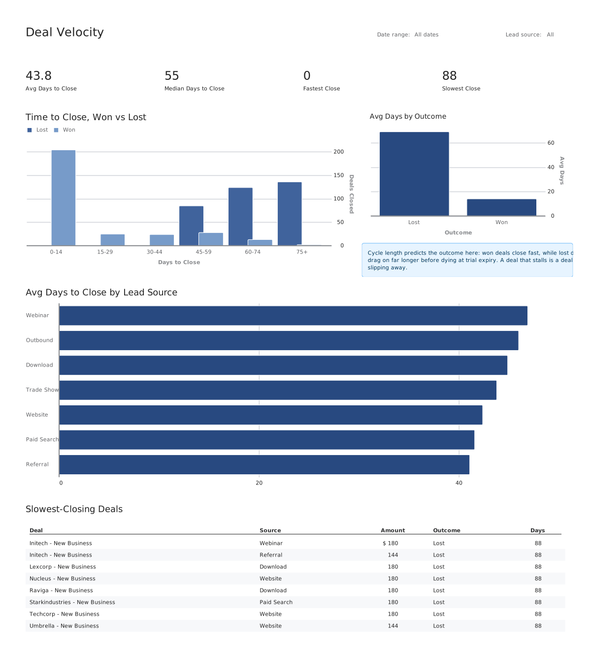
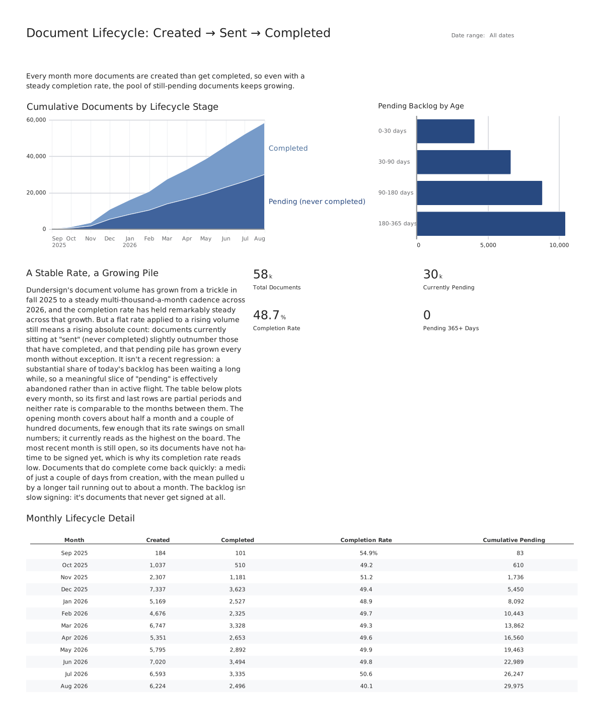
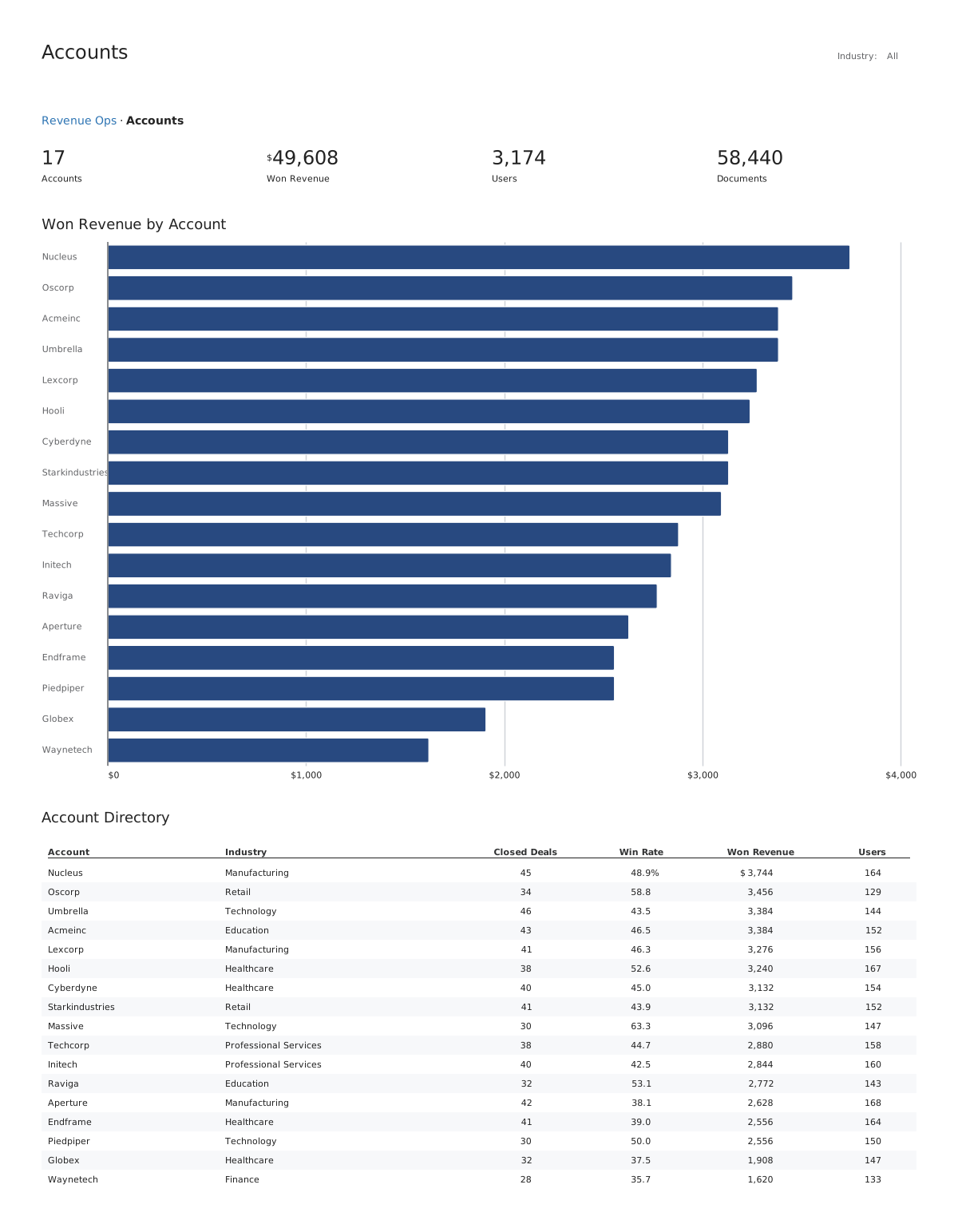
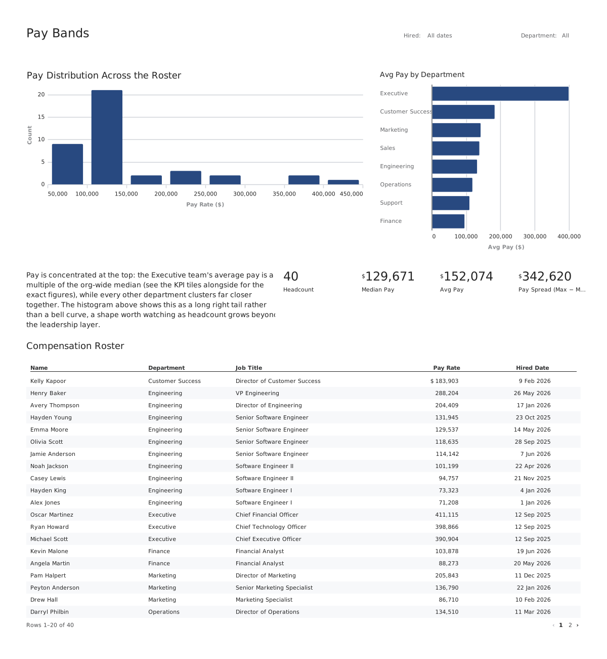
Every one of these is YAML.
Rendered by the same engine, from the same syntax the rest of this page is written in. No plugin API, no escape hatch into JavaScript.
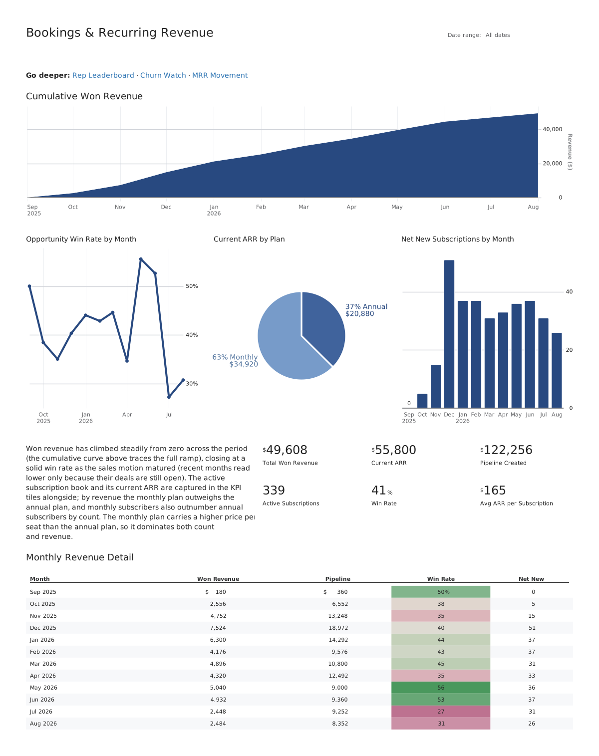
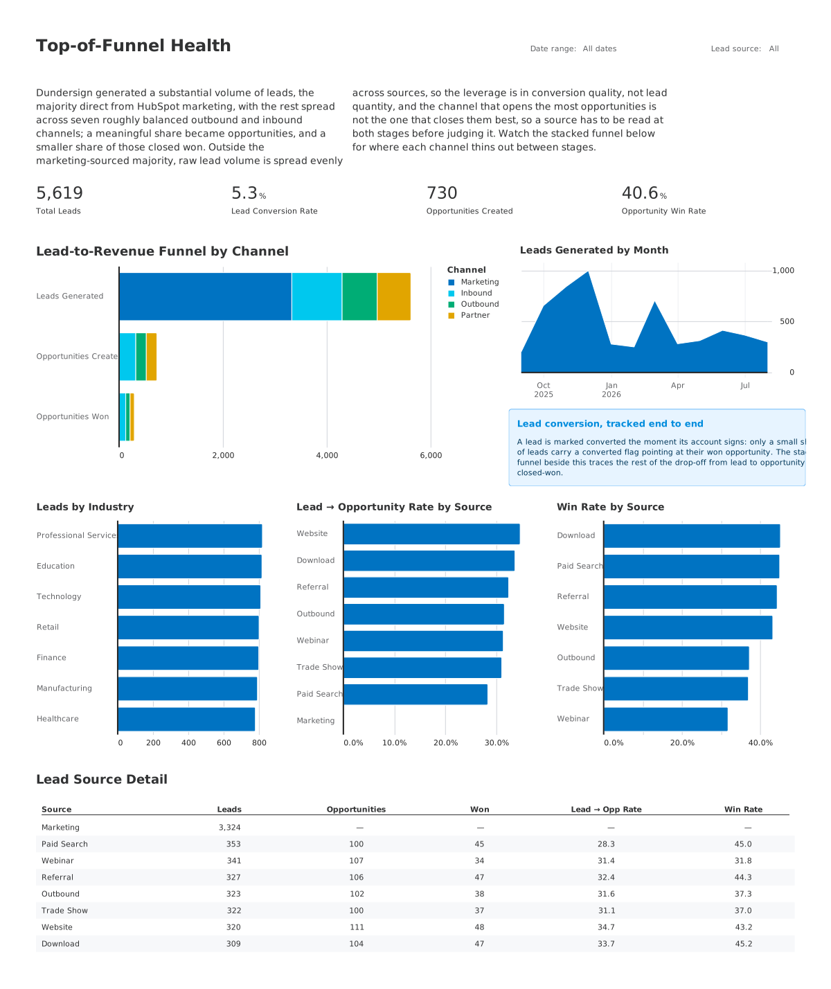
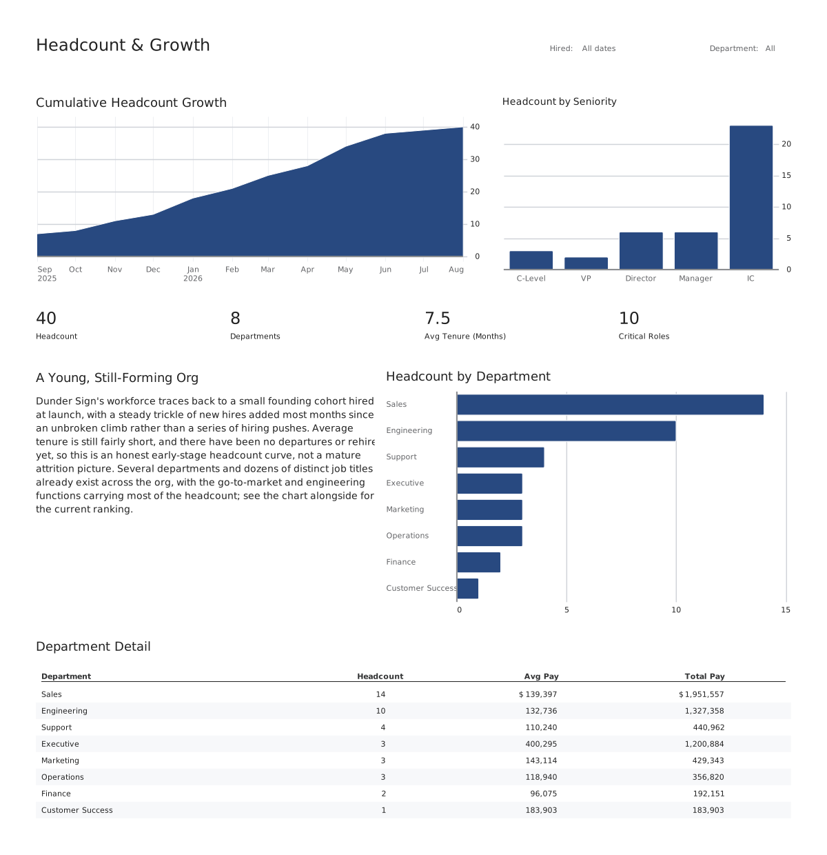
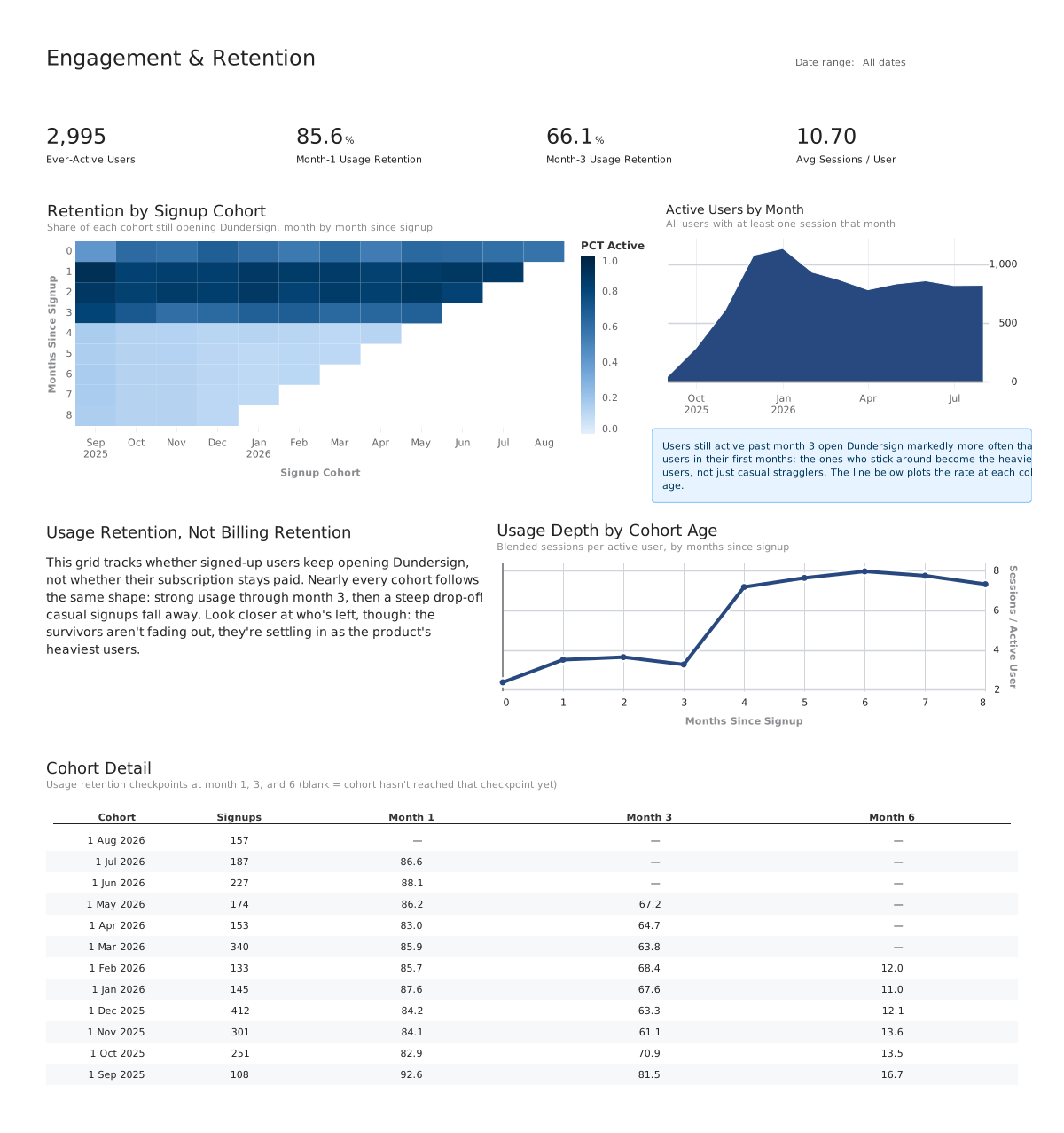
One line
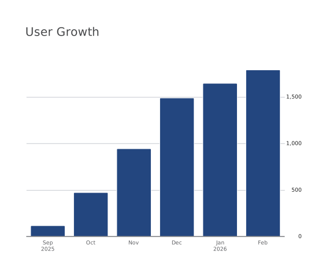
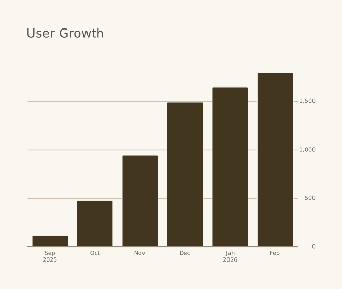
Fully customizable themes
One line switches the theme, and it reaches everything: ground, palette, type, grid, spacing. Themes are files that cascade, project to theme to board to chart, so they diff.
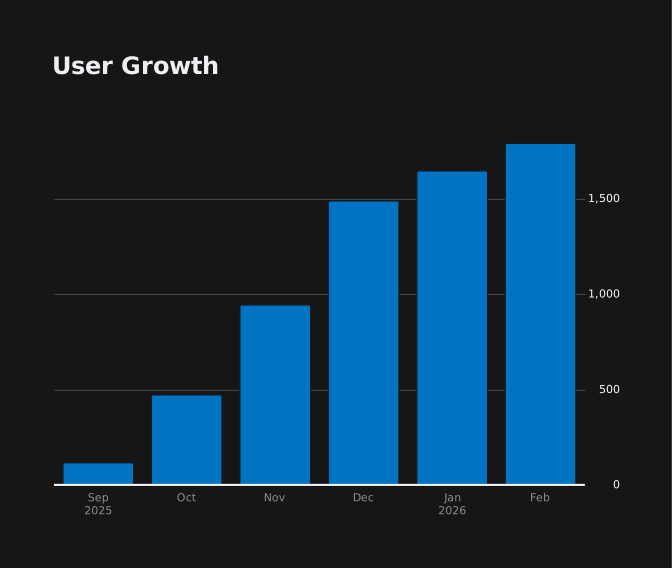
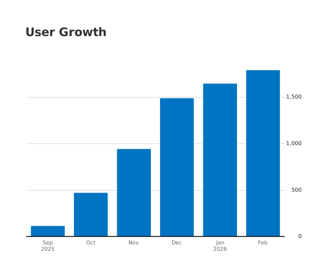
A board, from scratch
Start with a query. Add only what you need.
The file on the left is the whole board; the right is what it renders. The highlighted line is the only thing each step changed. Each step shows the whole board file, with the lines that step changed highlighted, and the board it renders. Nothing here is a mockup.
Step 1 · A query
A board starts as a named query. Point a chart at it and you get the rows back in the order the SQL returned them.
title: User growthqueries: users: | SELECT DATE_TRUNC('month', created_at) AS month, SUM(COUNT(*)) OVER (ORDER BY MIN(created_at)) AS users FROM users GROUP BY 1 ORDER BY 1 LIMIT 6charts: users: query: queries.users type: table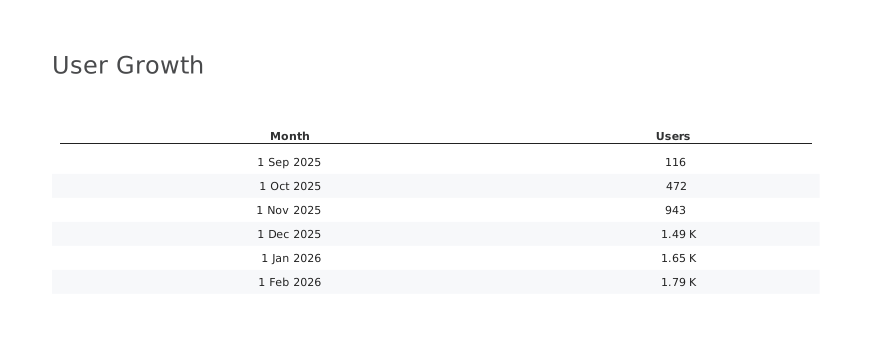
Step 2 · A chart
Say how to see it. The chart layer never aggregates or reorders: it reads the columns the query produced, so nothing here can change the number.
title: User growthqueries: users: | SELECT DATE_TRUNC('month', created_at) AS month, SUM(COUNT(*)) OVER (ORDER BY MIN(created_at)) AS users FROM users GROUP BY 1 ORDER BY 1 LIMIT 6charts: users: query: queries.users type: scatter x: month y: users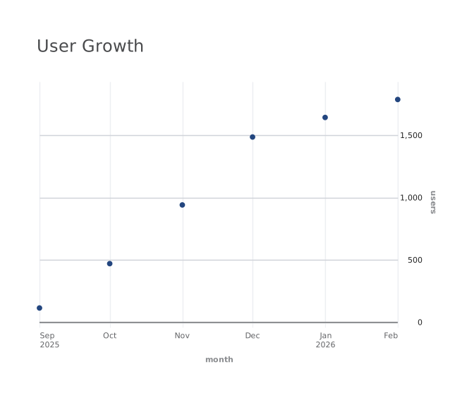
Step 3 · Change one word
Every chart type reads the same two columns, so trying another one is a one word edit rather than a rewrite.
title: User growthqueries: users: | SELECT DATE_TRUNC('month', created_at) AS month, SUM(COUNT(*)) OVER (ORDER BY MIN(created_at)) AS users FROM users GROUP BY 1 ORDER BY 1 LIMIT 6charts: users: query: queries.users type: bar x: month y: users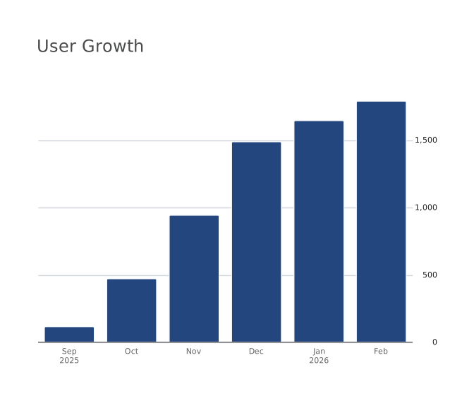
Step 4 · Change it again
Nothing about the query moved. Only the type changed, and the axis, labels, and numbers follow on their own.
title: User growthqueries: users: | SELECT DATE_TRUNC('month', created_at) AS month, SUM(COUNT(*)) OVER (ORDER BY MIN(created_at)) AS users FROM users GROUP BY 1 ORDER BY 1 LIMIT 6charts: users: query: queries.users type: line x: month y: users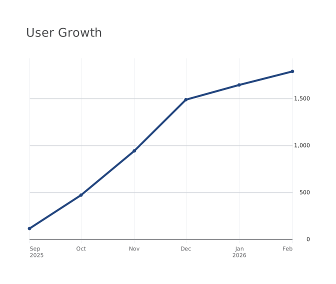
Step 5 · A second chart
Add a query, add a chart, and list them. Rows stack them down the board, each one the full width.
title: User growthqueries: users: | SELECT DATE_TRUNC('month', created_at) AS month, SUM(COUNT(*)) OVER (ORDER BY MIN(created_at)) AS users FROM users GROUP BY 1 ORDER BY 1 LIMIT 6 by_source: | SELECT signup_source, COUNT(*) AS users FROM users GROUP BY 1 ORDER BY 2 DESCcharts: users: title: Total users query: queries.users type: line x: month y: users by_source: title: Where they came from query: queries.by_source type: bar x: signup_source y: usersrows: [users, by_source]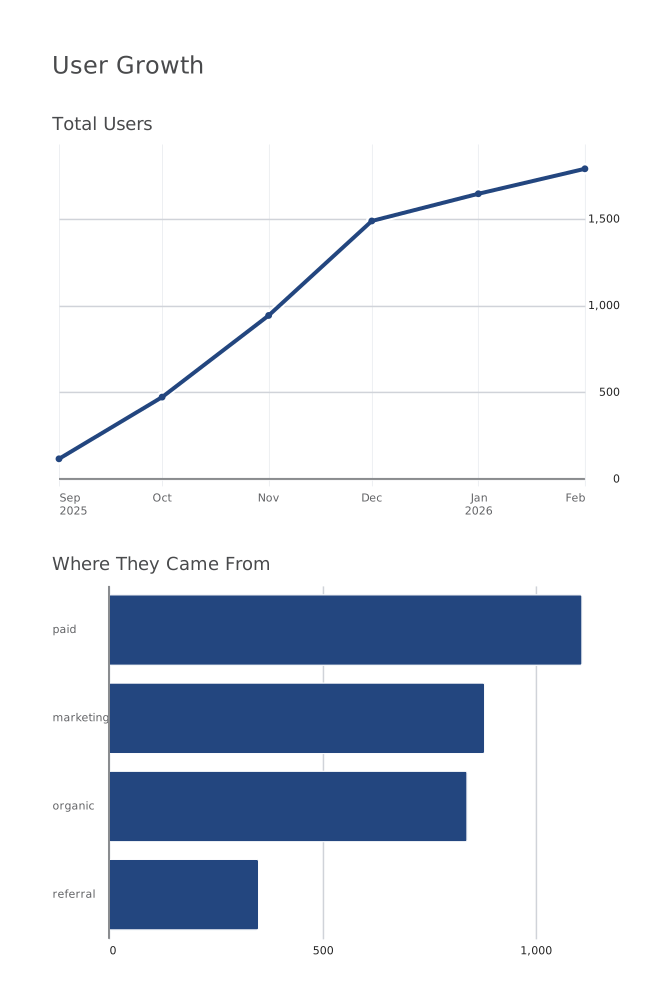
Step 6 · Change the layout
Columns put them side by side. That is the whole layout language: no drag targets, no pixel coordinates, and a diff that says what moved.
title: User growthqueries: users: | SELECT DATE_TRUNC('month', created_at) AS month, SUM(COUNT(*)) OVER (ORDER BY MIN(created_at)) AS users FROM users GROUP BY 1 ORDER BY 1 LIMIT 6 by_source: | SELECT signup_source, COUNT(*) AS users FROM users GROUP BY 1 ORDER BY 2 DESCcharts: users: title: Total users query: queries.users type: line x: month y: users by_source: title: Where they came from query: queries.by_source type: bar x: signup_source y: userscols: [users, by_source]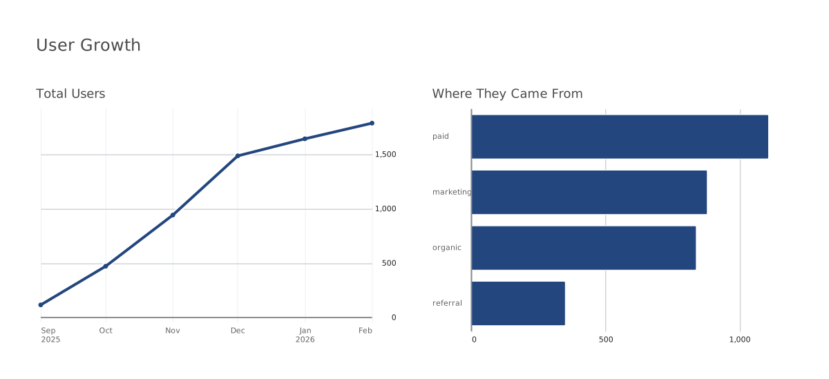
title: User growthqueries: users: | SELECT DATE_TRUNC('month', created_at) AS month, SUM(COUNT(*)) OVER (ORDER BY MIN(created_at)) AS users FROM users GROUP BY 1 ORDER BY 1 LIMIT 6charts: users: query: queries.users type: tabletitle: User growthqueries: users: | SELECT DATE_TRUNC('month', created_at) AS month, SUM(COUNT(*)) OVER (ORDER BY MIN(created_at)) AS users FROM users GROUP BY 1 ORDER BY 1 LIMIT 6charts: users: query: queries.users type: scatter x: month y: userstitle: User growthqueries: users: | SELECT DATE_TRUNC('month', created_at) AS month, SUM(COUNT(*)) OVER (ORDER BY MIN(created_at)) AS users FROM users GROUP BY 1 ORDER BY 1 LIMIT 6charts: users: query: queries.users type: bar x: month y: userstitle: User growthqueries: users: | SELECT DATE_TRUNC('month', created_at) AS month, SUM(COUNT(*)) OVER (ORDER BY MIN(created_at)) AS users FROM users GROUP BY 1 ORDER BY 1 LIMIT 6charts: users: query: queries.users type: line x: month y: userstitle: User growthqueries: users: | SELECT DATE_TRUNC('month', created_at) AS month, SUM(COUNT(*)) OVER (ORDER BY MIN(created_at)) AS users FROM users GROUP BY 1 ORDER BY 1 LIMIT 6 by_source: | SELECT signup_source, COUNT(*) AS users FROM users GROUP BY 1 ORDER BY 2 DESCcharts: users: title: Total users query: queries.users type: line x: month y: users by_source: title: Where they came from query: queries.by_source type: bar x: signup_source y: usersrows: [users, by_source]title: User growthqueries: users: | SELECT DATE_TRUNC('month', created_at) AS month, SUM(COUNT(*)) OVER (ORDER BY MIN(created_at)) AS users FROM users GROUP BY 1 ORDER BY 1 LIMIT 6 by_source: | SELECT signup_source, COUNT(*) AS users FROM users GROUP BY 1 ORDER BY 2 DESCcharts: users: title: Total users query: queries.users type: line x: month y: users by_source: title: Where they came from query: queries.by_source type: bar x: signup_source y: userscols: [users, by_source]A board starts as a named query. Point a chart at it and you get the rows back in the order the SQL returned them.
Say how to see it. The chart layer never aggregates or reorders: it reads the columns the query produced, so nothing here can change the number.
Every chart type reads the same two columns, so trying another one is a one word edit rather than a rewrite.
Nothing about the query moved. Only the type changed, and the axis, labels, and numbers follow on their own.
Add a query, add a chart, and list them. Rows stack them down the board, each one the full width.
Columns put them side by side. That is the whole layout language: no drag targets, no pixel coordinates, and a diff that says what moved.
Two declarations
SQL declares what data to show.
Now declare how to show it.
Charting never got the same treatment: a GUI that hides the decisions, or a plotting API where the answer depends on call order. dbt Charts is the missing half: a declarative language for how data is seen.
Neither half hides logic from the other. The query owns what the numbers mean; the chart owns nothing but how they look.
title: Revenue by month
source: db

charts:
  revenue:
    query: |
      SELECT
        date_trunc('month', order_date) AS month,
        sum(revenue) AS revenue
      FROM fct_orders
      GROUP BY 1    type: bar
    x: month
    y: revenue
Filters and links
The filters are in the file too.
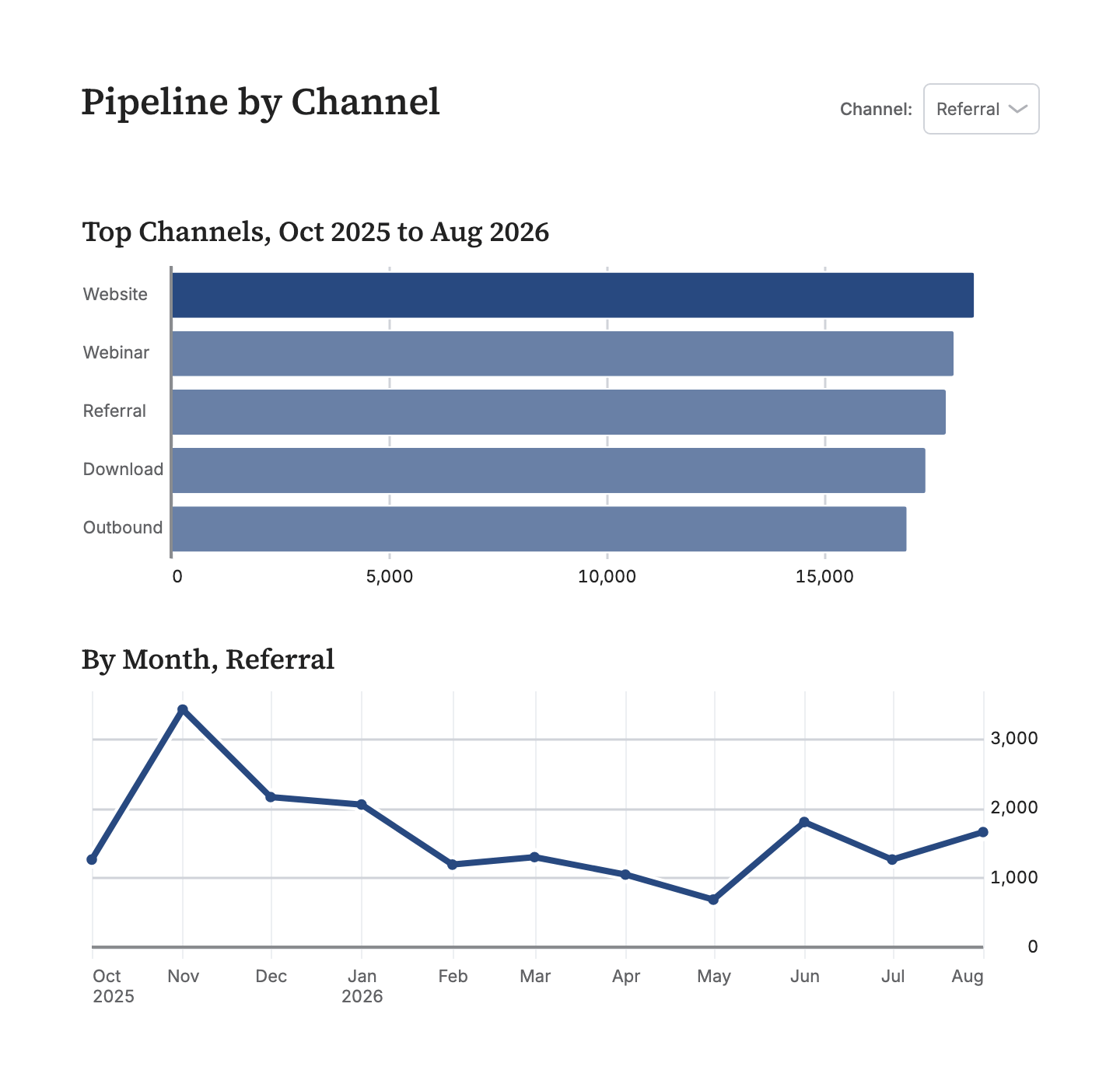
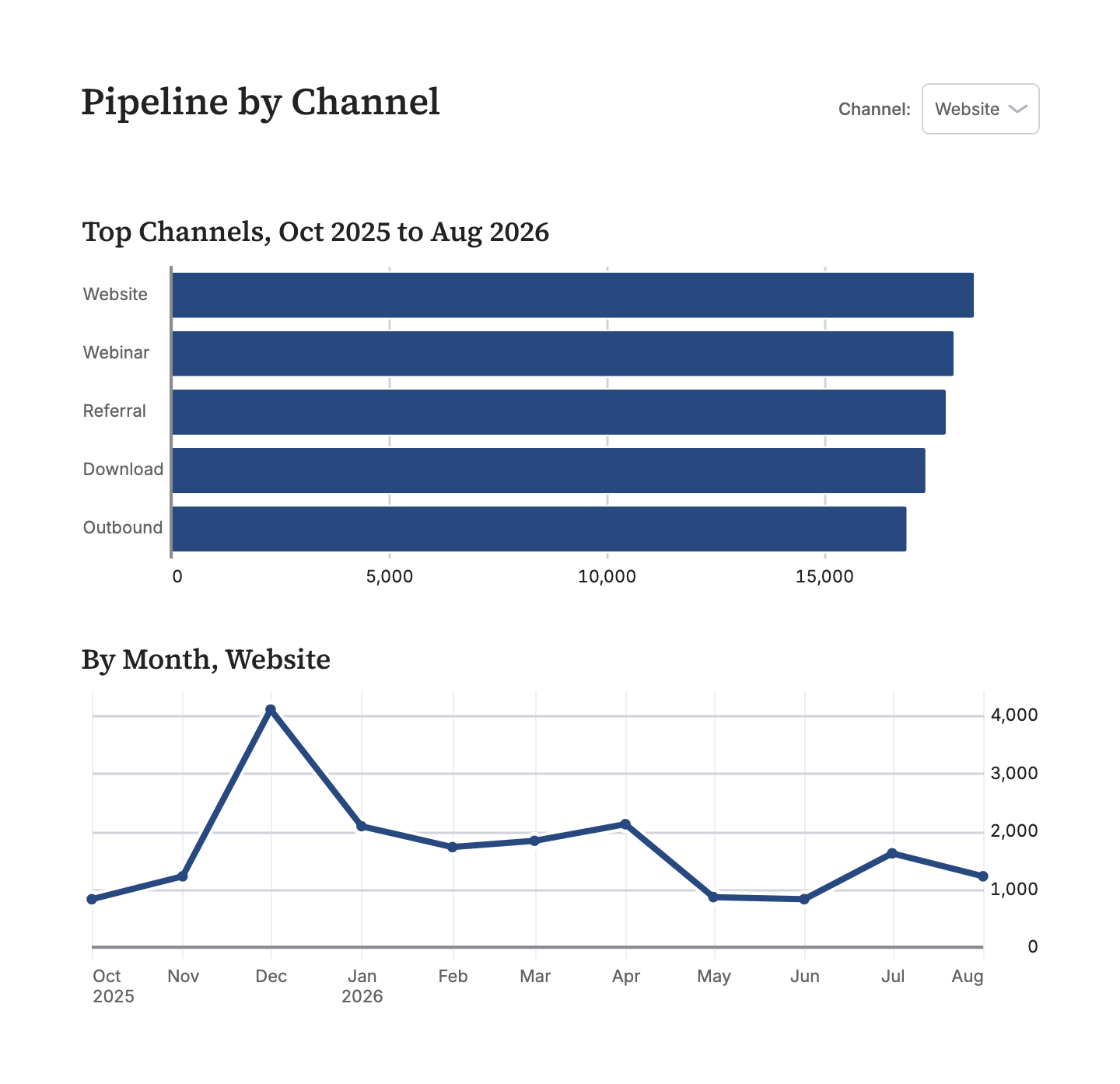
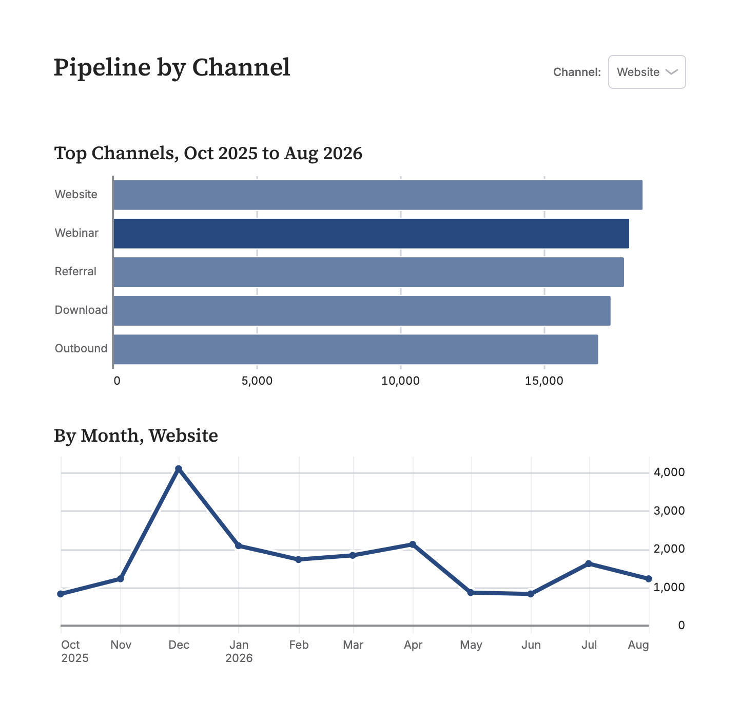
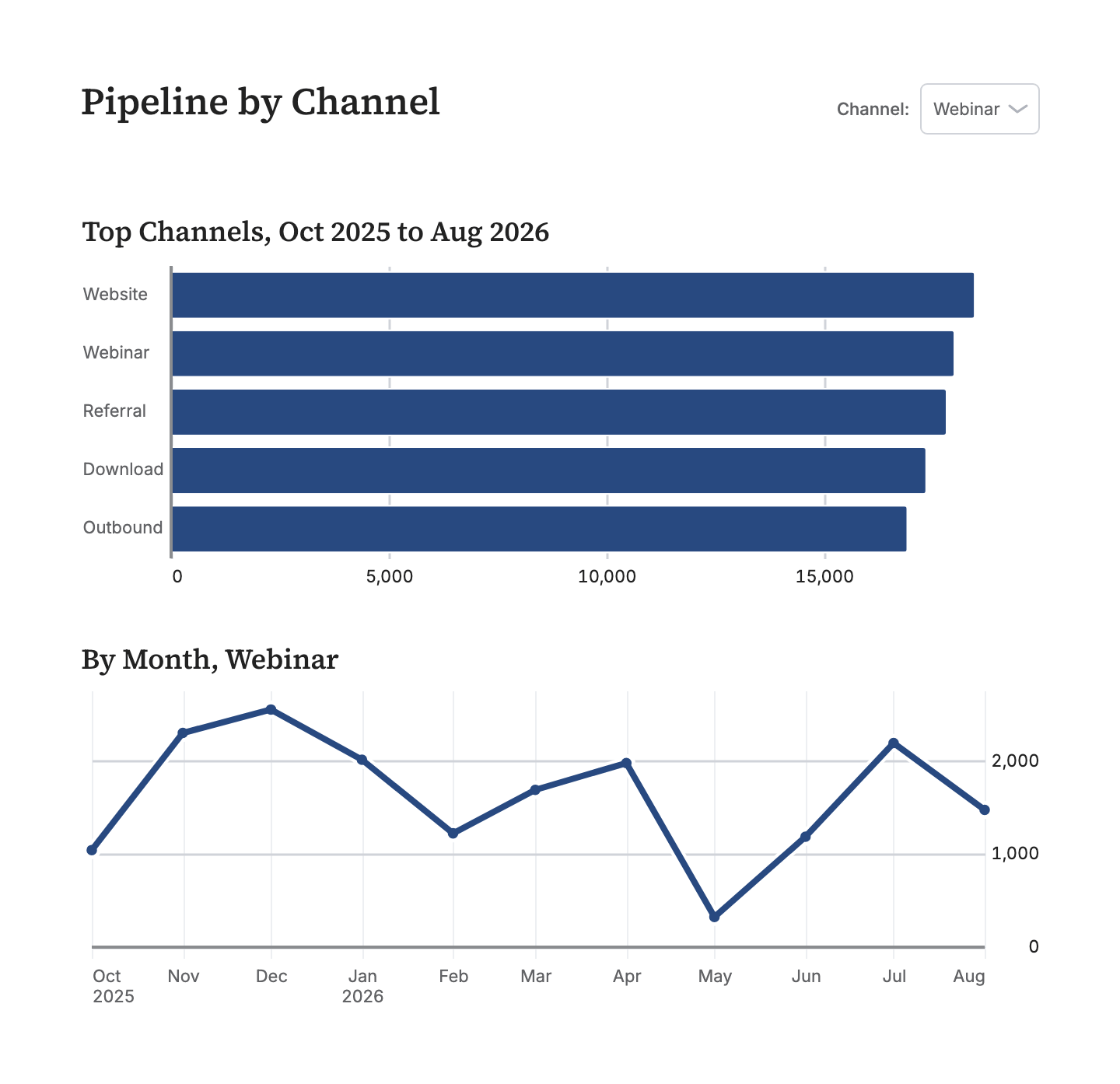
A board declares its filter variables beside its queries. Each one renders as a control, and its value is a query parameter, so a filtered board is a URL you can paste into a thread. link: on a chart makes every bar, point, and row a link: to a different filtered view of the same board, or a jump to another board.
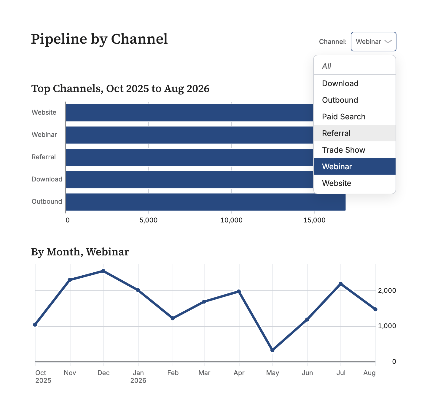
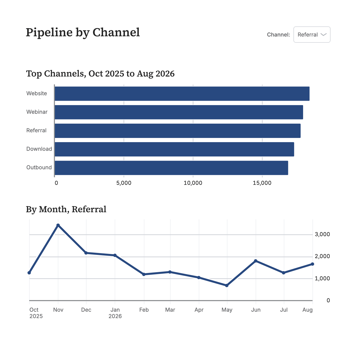
title: Pipeline by channelwidth: 720variables: channel: column: opportunities.lead_sourcequeries:⋯ 2 queries
by_channel: | SELECT lead_source AS channel, SUM(amount) AS pipeline FROM opportunities WHERE created_at >= '2025-10-01' GROUP BY 1 ORDER BY 2 DESC LIMIT 5 by_month: | SELECT DATE_TRUNC('month', created_at) AS month, SUM(amount) AS pipeline FROM opportunities WHERE created_at >= '2025-10-01' AND {{ filter('lead_source', channel) }} GROUP BY 1 ORDER BY 1charts: by_channel: title: Top channels, Oct 2025 to Aug 2026 query: queries.by_channel type: bar x: channel y: pipeline height: 200 link: "?channel={{ x }}" by_month: title: "By month, {{ channel or 'all channels' }}" query: queries.by_month type: line x: month y: pipeline height: 230rows: [by_channel, by_month]Click a bar, or pick from the menu. The URL is the filter.
Filters are variables
Declare a filter variable, wire it into SQL with filter(), and it renders as a control: a dropdown, a multiselect, a date range with presets, a slider, a checkbox. A variable nobody has set filters nothing.
The URL is the state
Every variable is a query parameter, so ?channel=Referral is a filtered board, and a filtered board is a link you can paste into a thread. A hidden variable works the same way, which is how one detail board serves every account.
A click is a link
link: on a chart makes every bar, point, and row a link. ?channel={{ x }} filters the charts beside it in place; a path opens another board with the clicked value carried along. Tables link a whole row, or one column.
Prose
Reports, not just dashboards
We believe more dashboards will be reports with extensive text analysis, and we've built first class prose support with markdown.
  - text: |
      ## Why Q3 turned

      Two things moved: enterprise renewals landed early, and
      **self-serve churn** fell for the first time in a year.
      Signups held their climb through the quarter, so the lift
      is retention, not acquisition.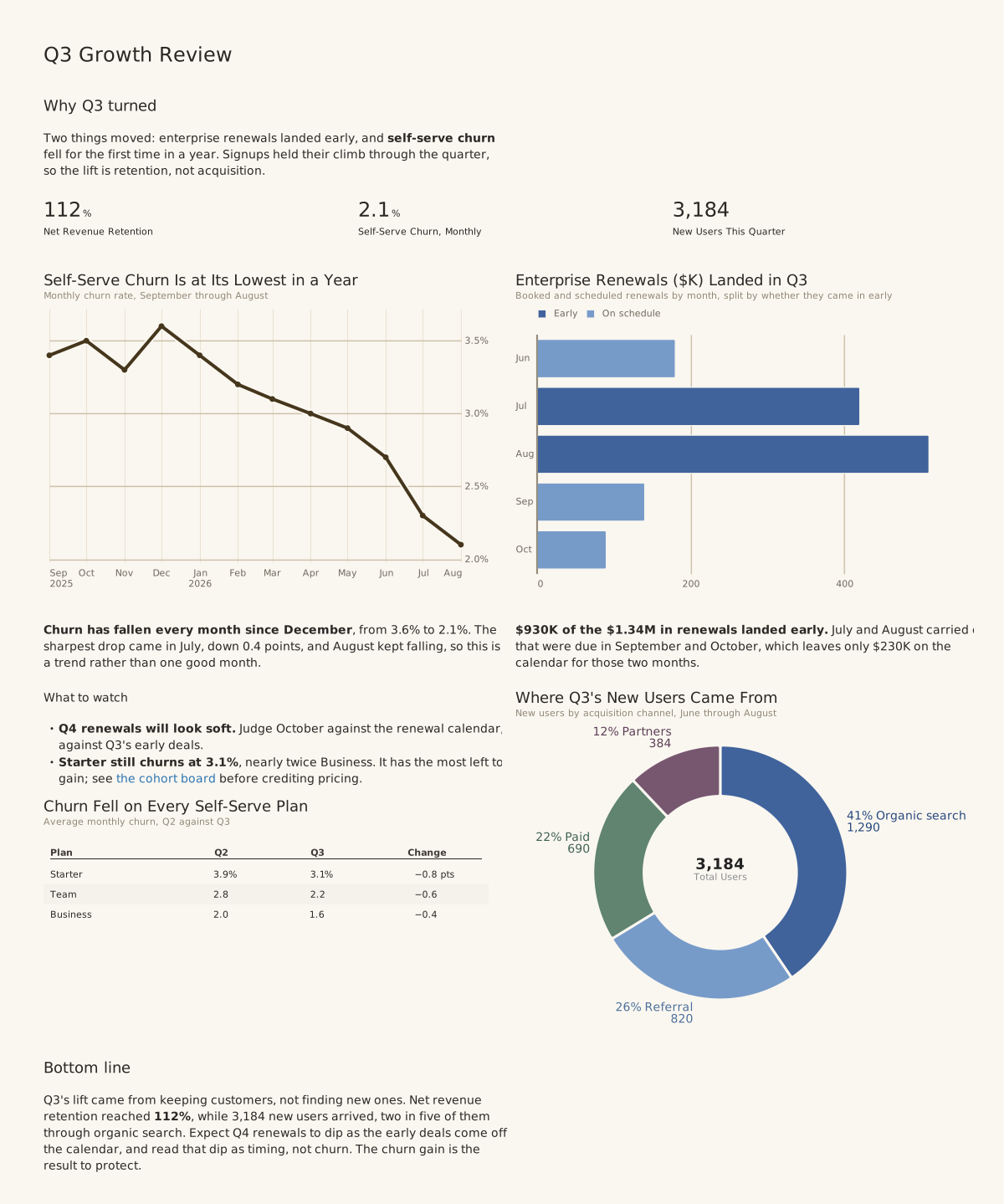
Visualization linting
Visual feedback for the AI
Agents can be a bit blind. We detect common visualization blunders and raise errors or warnings, so they can ensure an excellent final version.
$ dct render charts/revenue.yml

WARN-BAR-BAND-WIDTH-TOO-NARROW
  charts/revenue.yml:14
  182 bands x 2 series across 640px
  (~1.4px per bar), so bars will read as
  a merged block instead of separate marks.
  Fix: roll up to a coarser grain (day -> week).

WARN-TABLE-COLUMNS-OVERFLOW
  charts/revenue.yml:31
  Table needs 980px but only 640px is available.
  Fix: drop columns or widen the slot.
Two minutes to a board
Have your agent use dbt Charts.
Everything above is what an agent gets for free: a language it can write, validation that says when it is wrong, and a render it can look at. Say the sentence in Claude Code, Codex, or any coding agent with a terminal, and dct skills chart teaches it the rest. Prefer to type? The install is one line.
Claude Code
Codex · others
Codex · others
I want to make charts of this data with dbt Charts. Run `uv tool install dbt-charts`, then `dct skills chart`, and follow what it prints.
Terminal
uv tool install dbt-charts
In claude.ai or ChatGPT, with nothing to install? Start on dbtCharts.com ↗
Agents that arrive on their own read dbtCharts.com/llms.txt.
Hosted
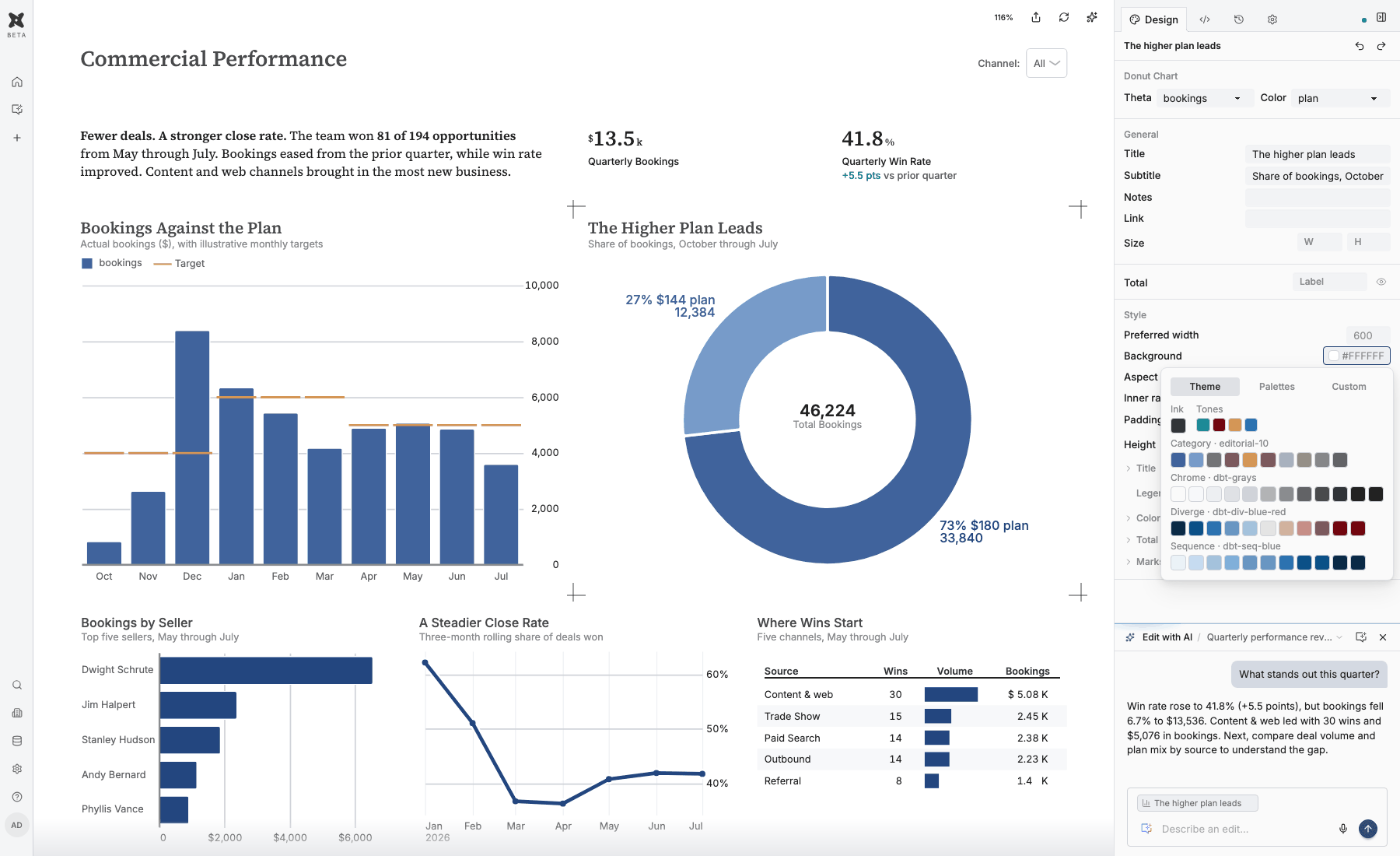
The platform
Turn a working board into a shared place for analysis. Build with an agent, refine in the visual editor, publish to the people who rely on it. One open definition connects every step.
- Conversational analytics on your warehouse
- A visual editor for the finishing touches
- Sharing with permissions. Free to start.
Open source
And by the way, it's all open source.
The language, the renderer, and the dct CLI are Apache 2.0, just like dbt.
Your first chart is four lines.
One sentence to Claude Code, Codex, or any coding agent, or one install at the terminal. The tool teaches the agent the rest.
Claude Code
Codex · others
Codex · others
I want to make charts of this data with dbt Charts. Run `uv tool install dbt-charts`, then `dct skills chart`, and follow what it prints.
Terminal
uv tool install dbt-charts
In claude.ai or ChatGPT, with nothing to install? Start on dbtCharts.com ↗